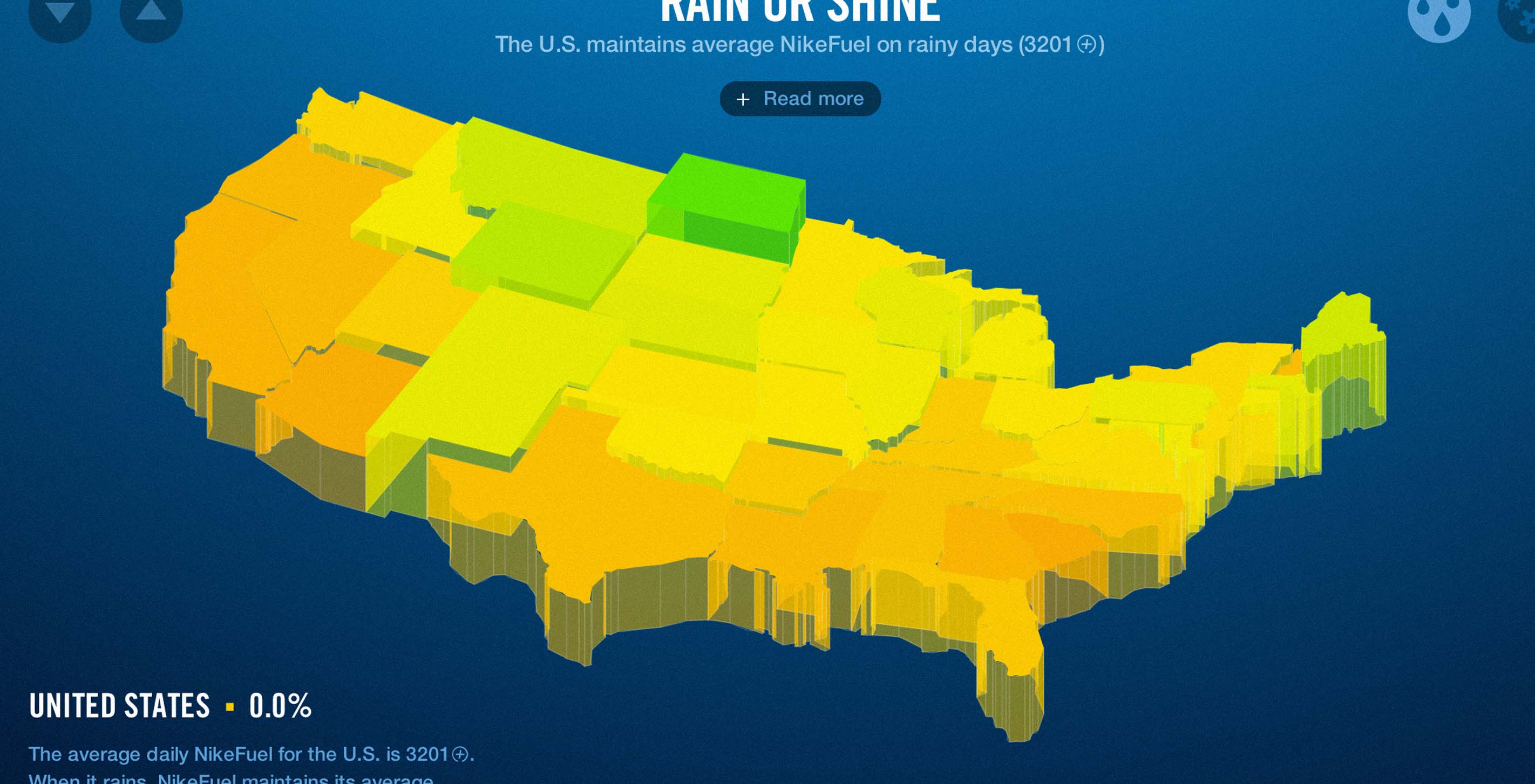
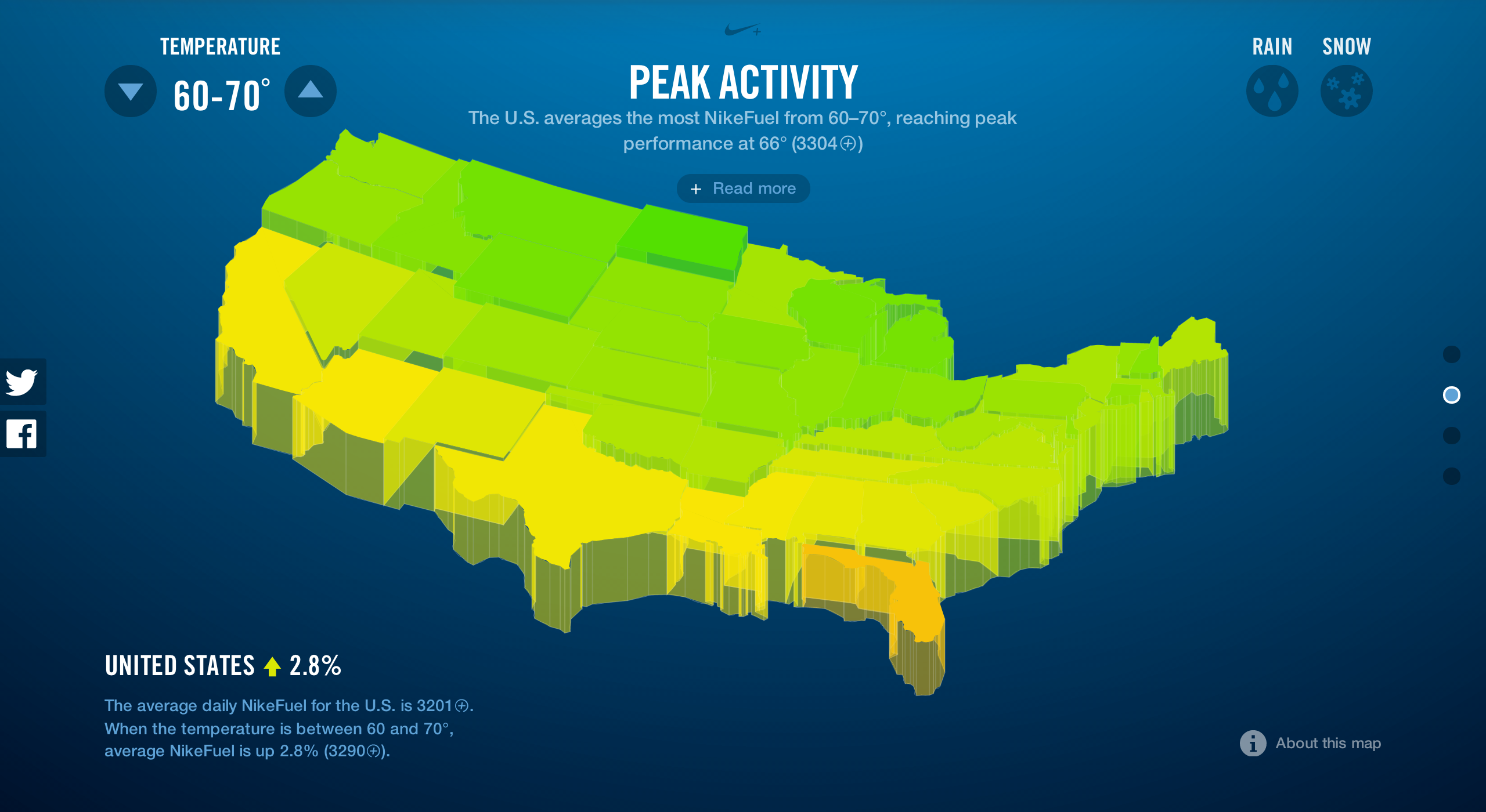
We connected minute-to-minute activity data for U.S. Nike+ FuelBand users with data from the nearest NOAA weather station. By associating each individual’s NikeFuel with the weather data most proximate to their postal code, we were able to see how regions reacted differently to varying types of weather. The Midwest improves the most as daily temperatures heat up, and the South is most negatively impacted when the cold blows in.
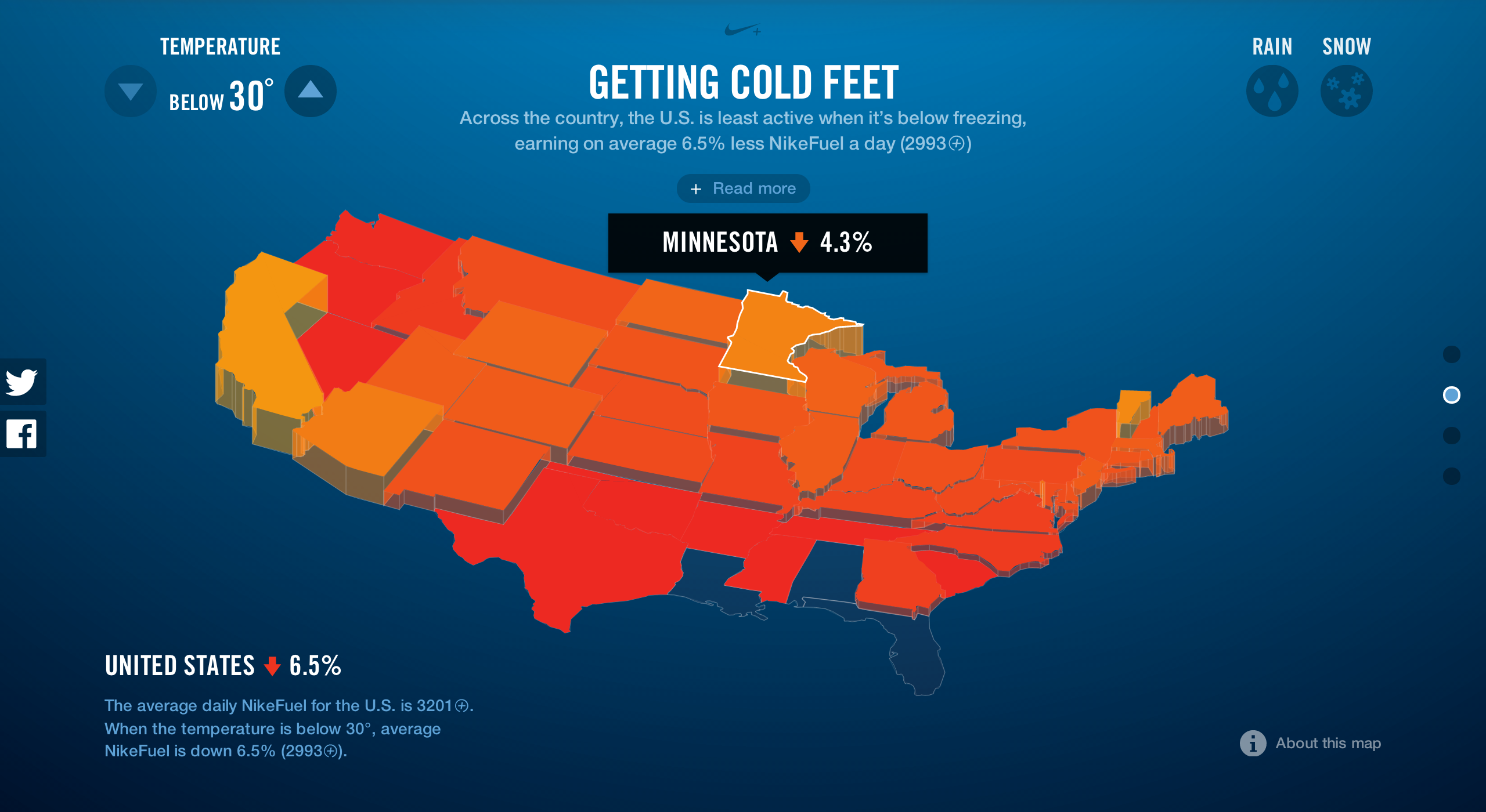
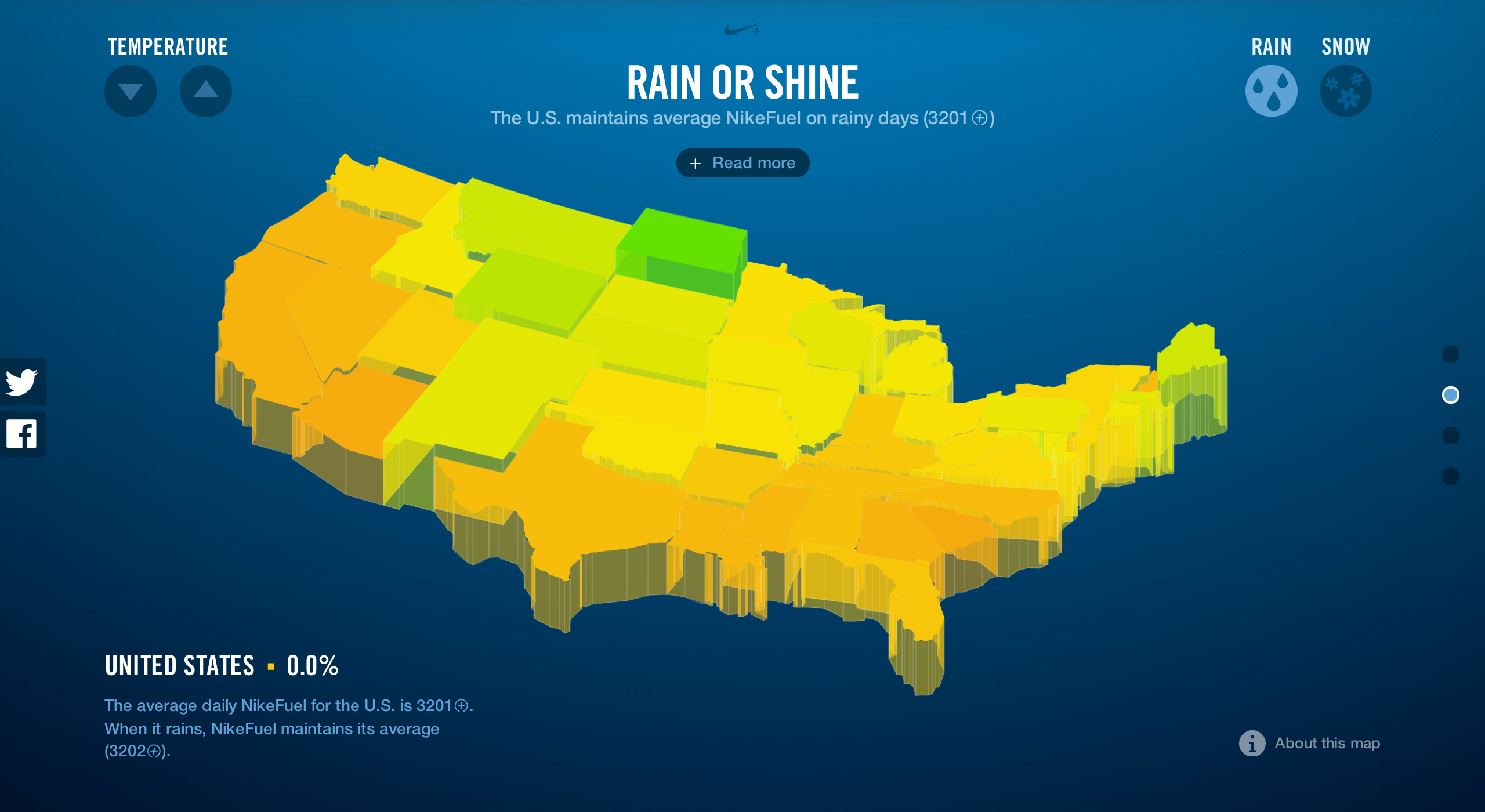
The map measures the percent difference of each state’s temperature-specific NikeFuel earnings from its overall average daily NikeFuel, so each state’s positive and negative changes are measured only in comparison to its own daily performance. Using the NikeFuel color scheme, low red states indicate that a state is performing far below its overall daily average, while raised green states are performing well above their overall average NikeFuel.
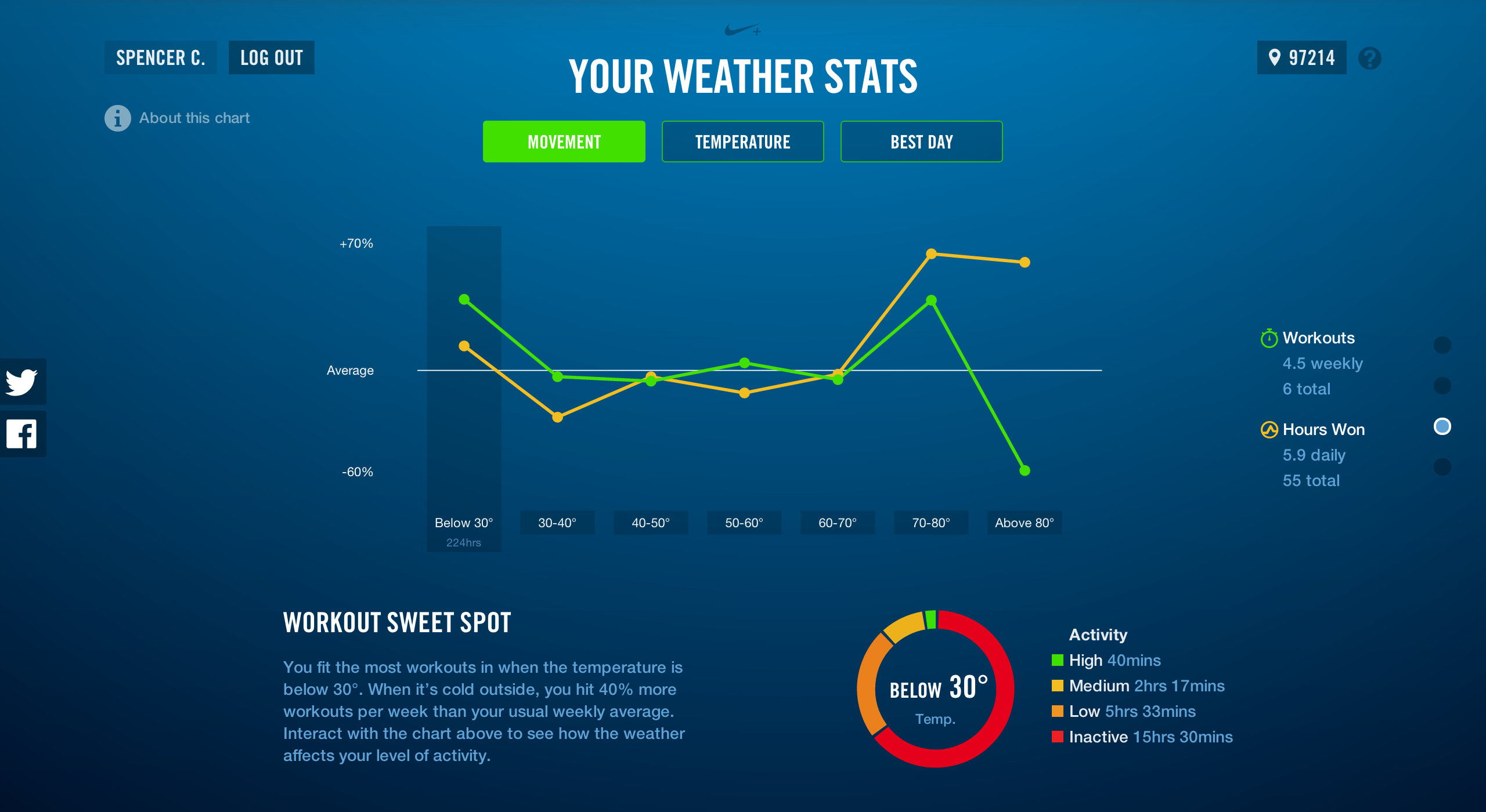
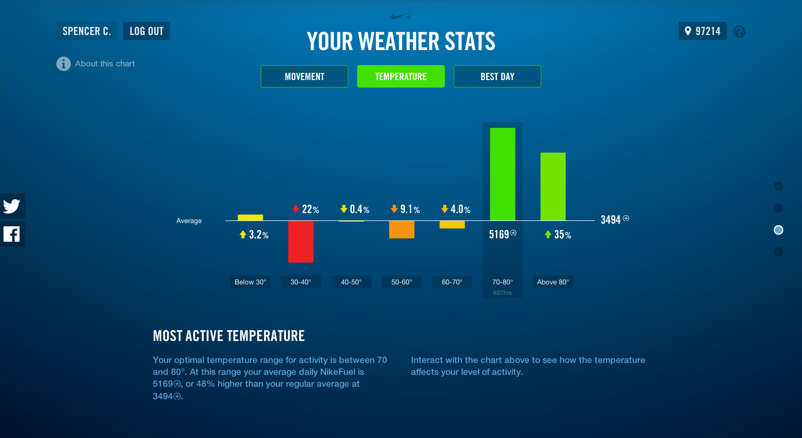
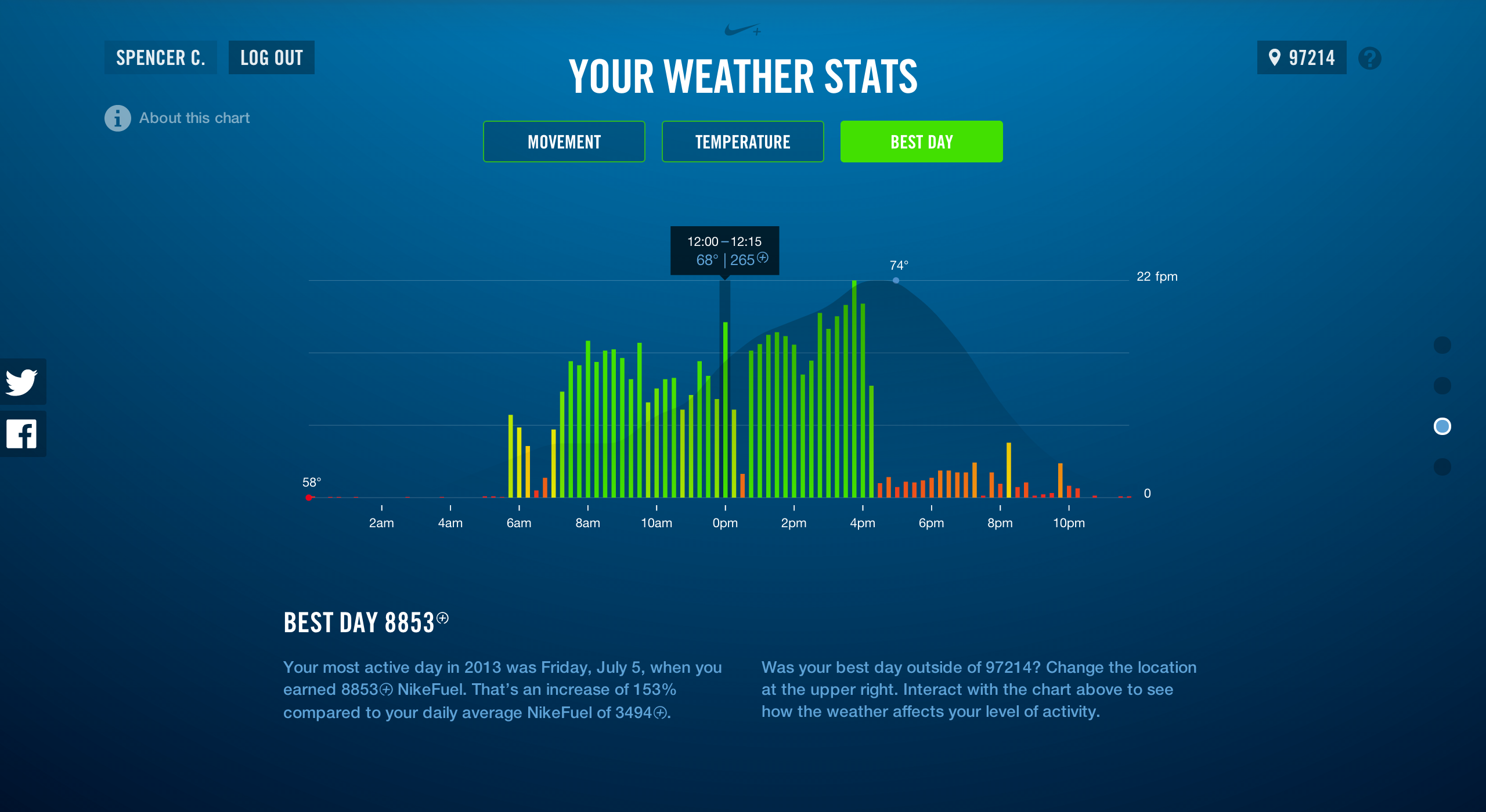
The site features personalized information about how the weather impacts individuals’ daily intensity levels and frequency of workouts. Nike+ FuelBand users can see the nuances between their general activity and the number of weekly workouts at each temperature range. FuelBand users can also see the weather on their “Best Day,” and find out their personal “Sweet Spot,” or the temperature at which they earn the most daily NikeFuel. To see one of our earlier projects exploring Nike+ FuelBand data, take a look at 2013 Year in NikeFuel.
We’re pretty excited about the site because it allows users to gain tangible insight on their behavioral patterns. It's easy to assume we get the rainy day blues, or that we’re more active when temperatures warm up, but NikeFuel Weather Activity gives an honest depiction of how the weather impacts our movement. Next time you feel like chatting about the weather, talk about your movement instead; we’ve got a hunch there aren’t too many degrees of separation between the two.
We’d love to hear what you’re working on, what you’re curious about, and what messy data problems we can help you solve. Drop us a line at hello@fathom.info, or you can subscribe to our newsletter for updates.