Nike
Year In NikeFuel
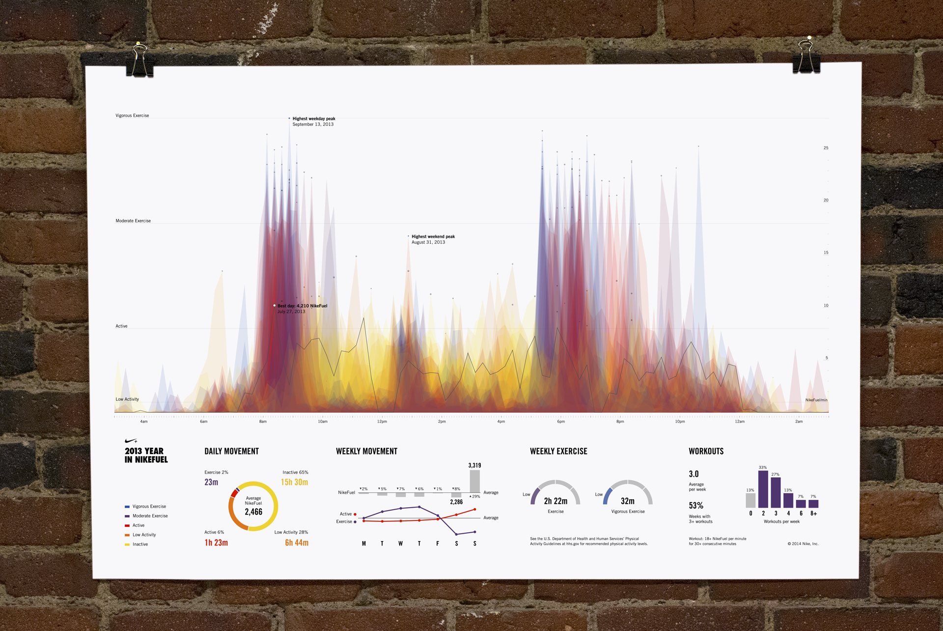
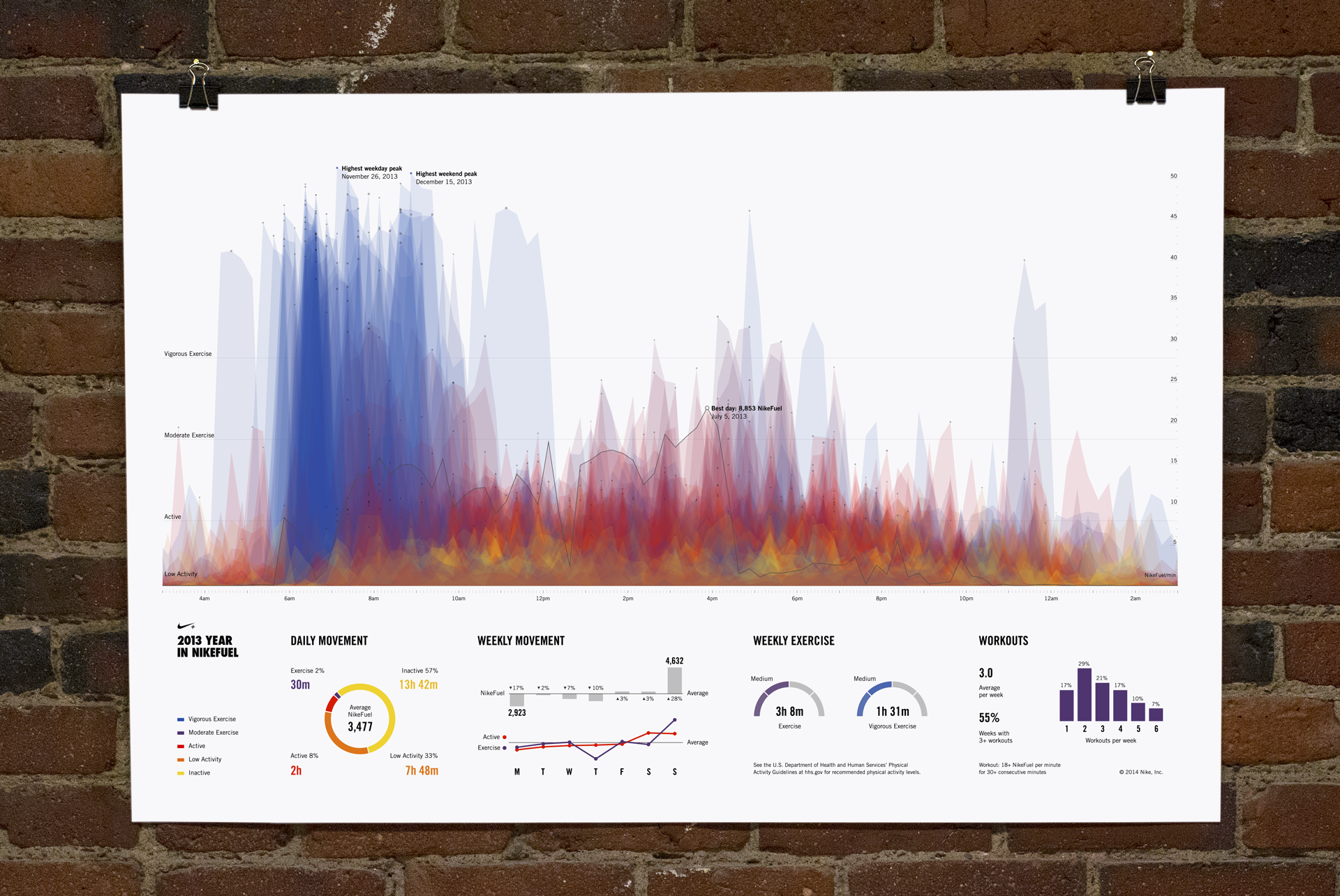
In collaboration with Nike, Fathom built and designed a website enabling every Nike+ FuelBand user worldwide to see a portrait of their unique physical activity patterns. Members could download and share a poster that depicts their daily movement for every day of the year.
Capabilities
- Data analysis and storyfinding
- Generative poster design
- Server set up for generating millions of posters
- Integration with Twitter’s API
Challenges
- Create a design system that would both represent Nike as a brand and showcase each individual user’s data
- Design and build the poster generating system in less than a month
- Build a server capable of generating millions of posters
Outcomes
- A custom and flexible generative design system that responded to different users’ data to create a unique thumbprint for each
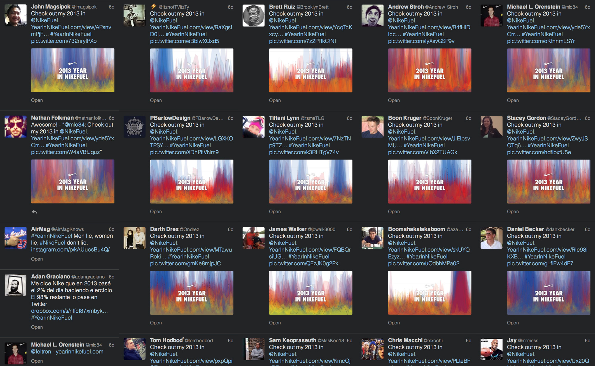
- Large social media response and spread
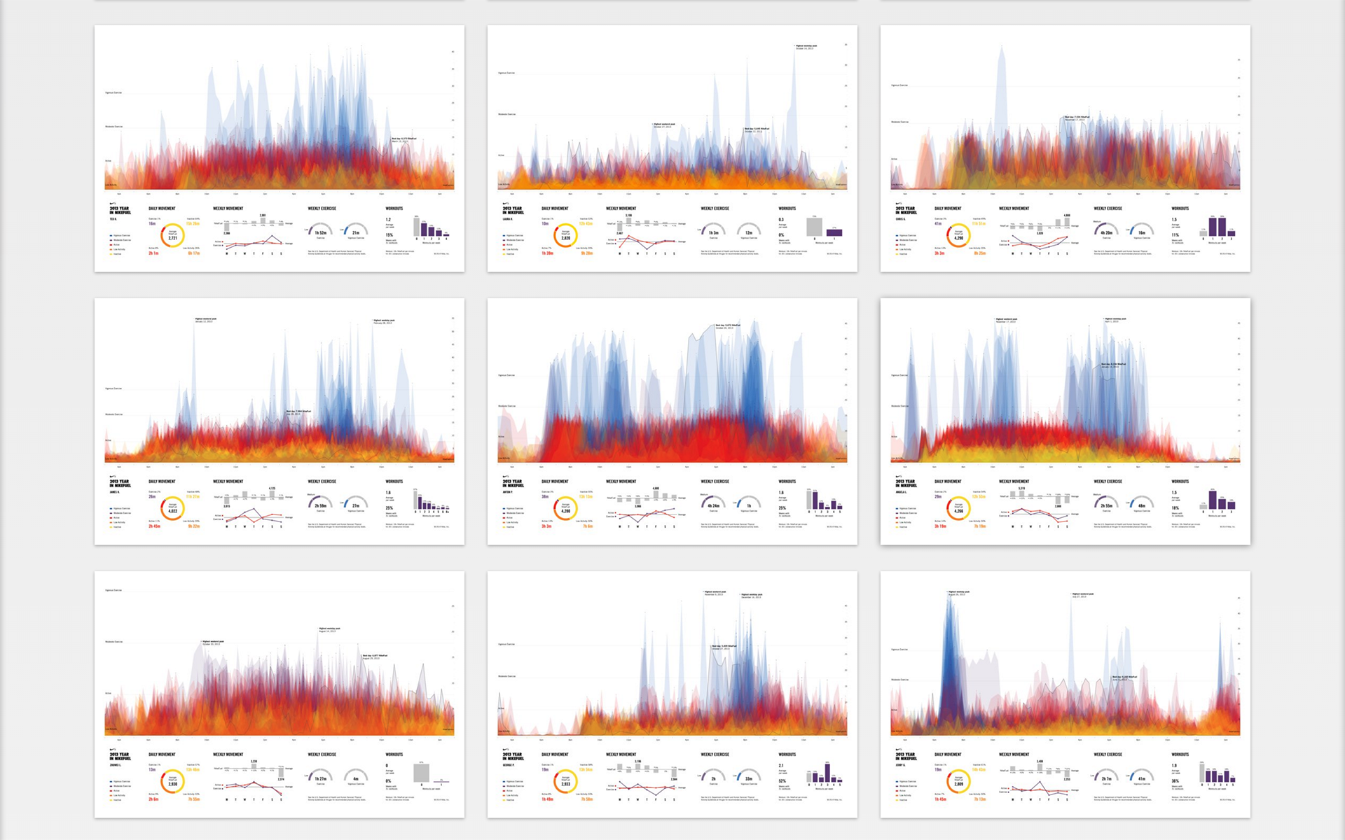
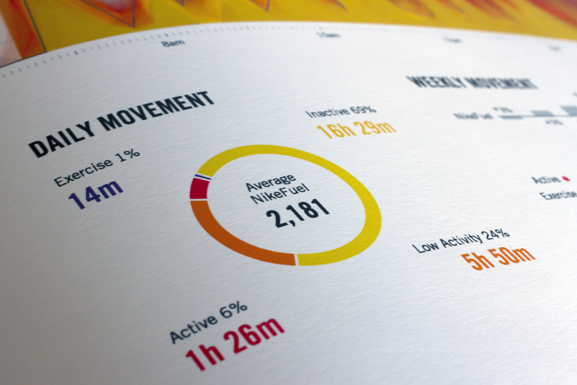
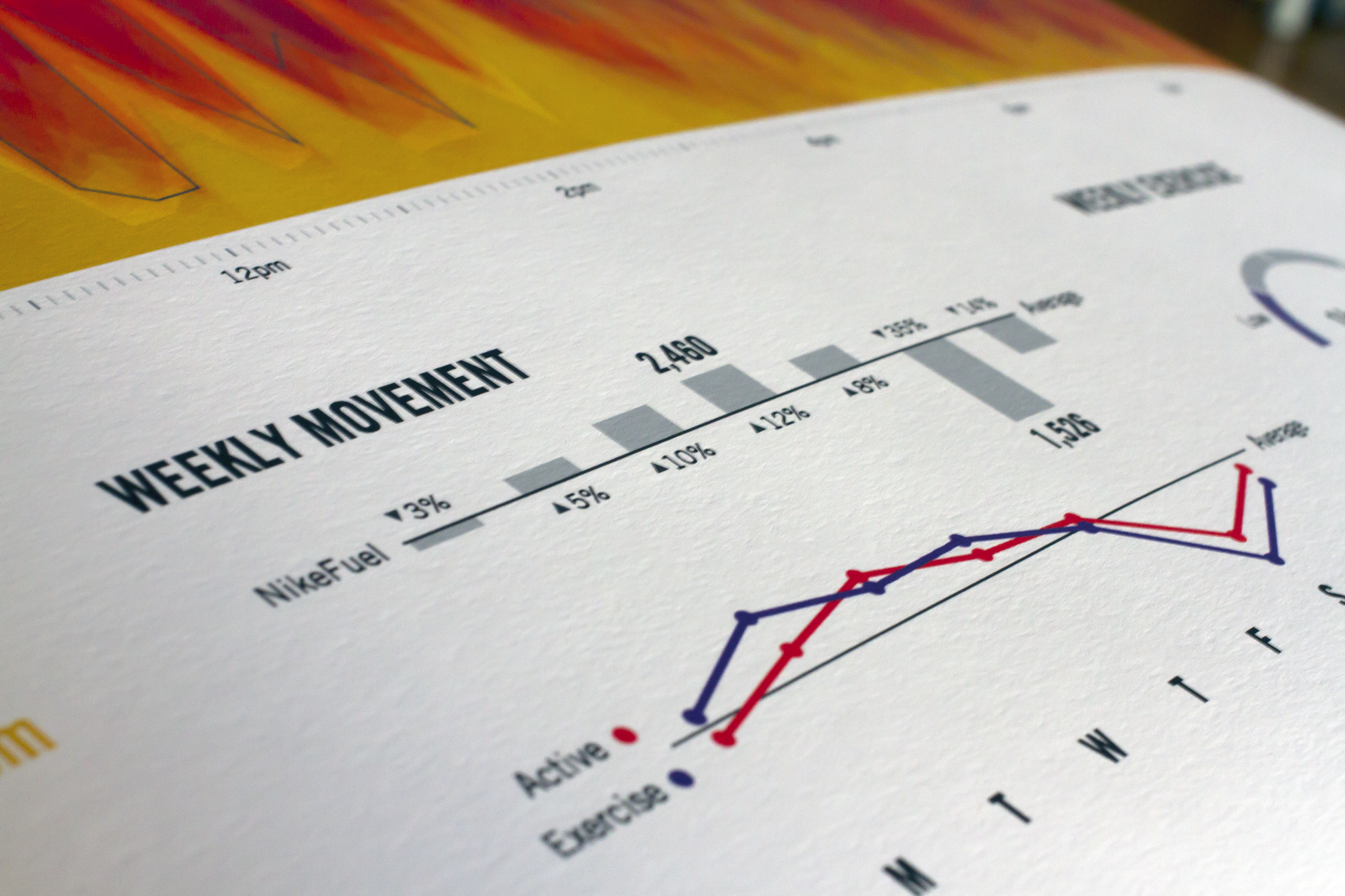
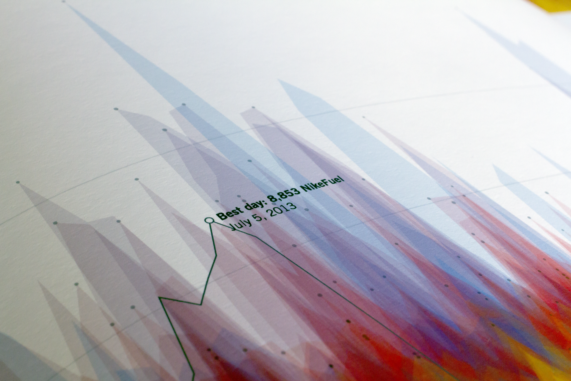
Each day is drawn as a partly transparent area chart—where the horizontal axis marks the time of day, and the vertical axis represents intensity of activity. Blue, red, and yellow shading depict days with high, moderate, and low levels of movement, respectively. Areas of the poster with higher concentration of color illustrate more ingrained patterns and behaviors. Beneath each person’s fire-like activity profile, a series of charts break down daily and weekly movement, and workouts. The top of the poster serves as a unique “fingerprint” of a person's behavior, routines, and lifestyle, while the bottom portion offers a detailed summary of their year in hard numbers.