athenahealth
Visualizing a day in the athenahealth network
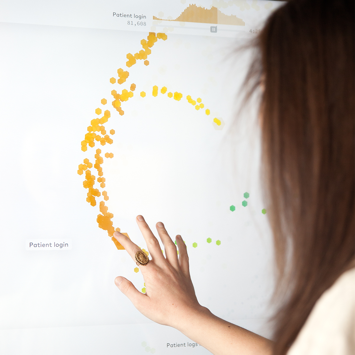
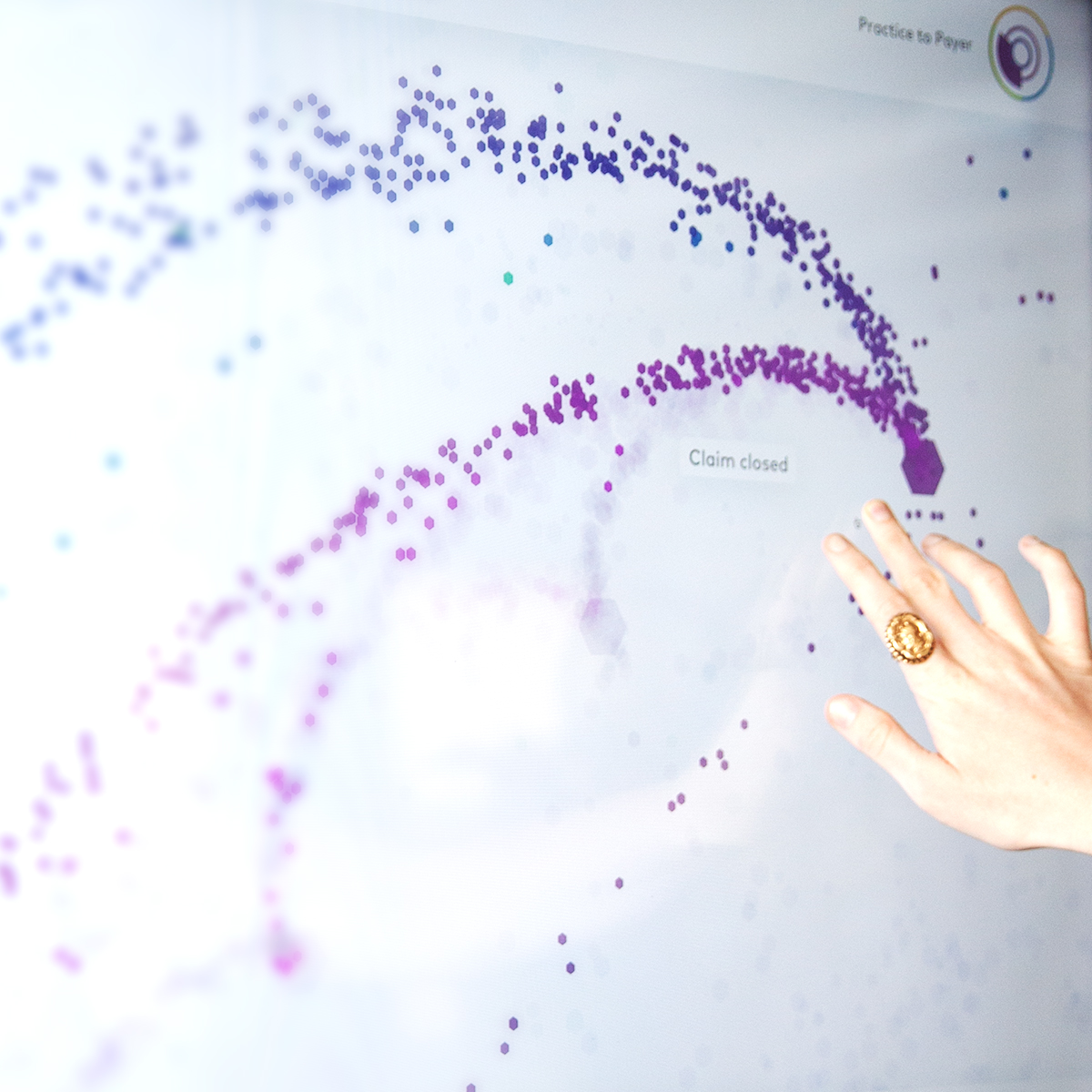
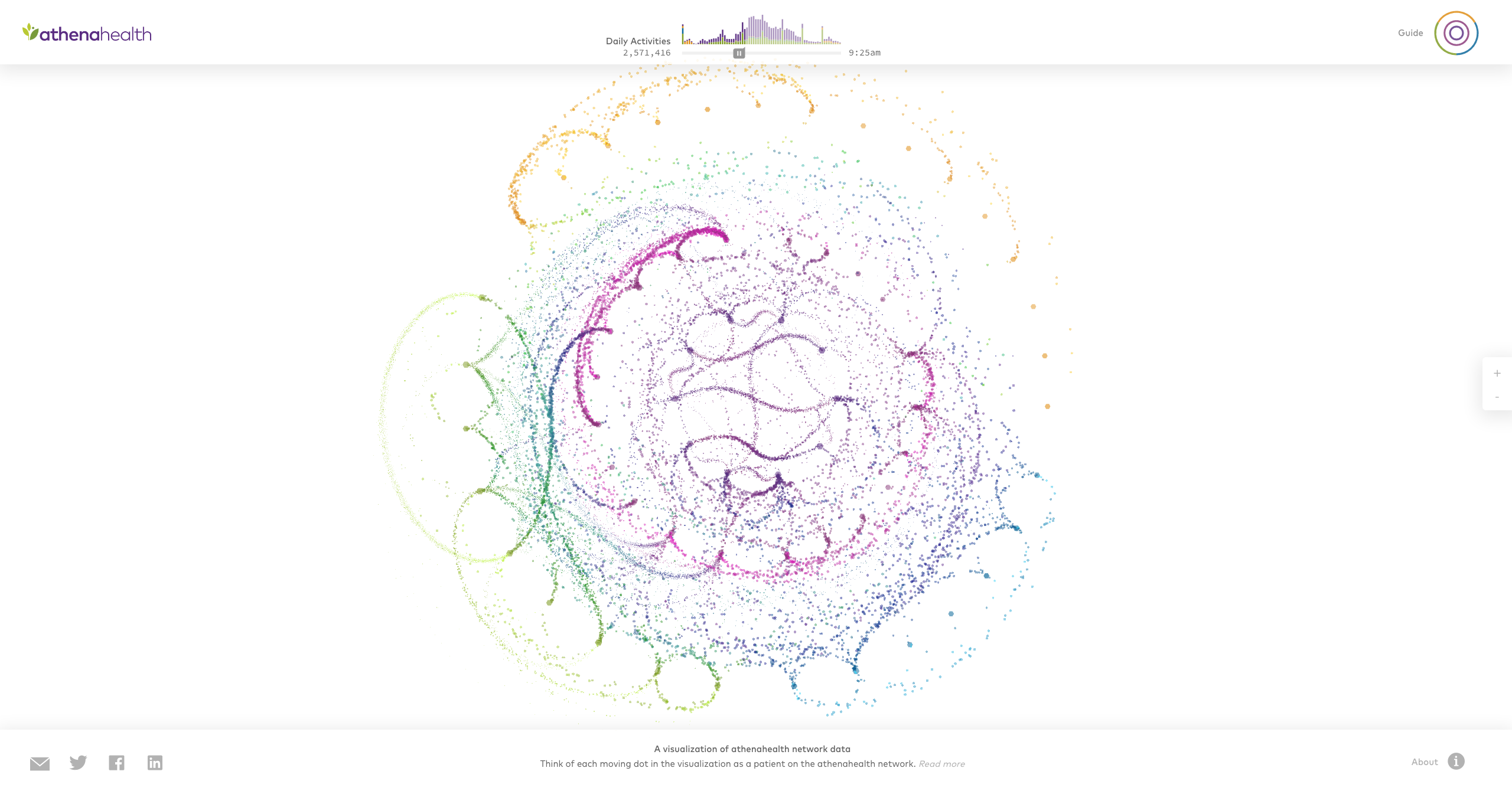
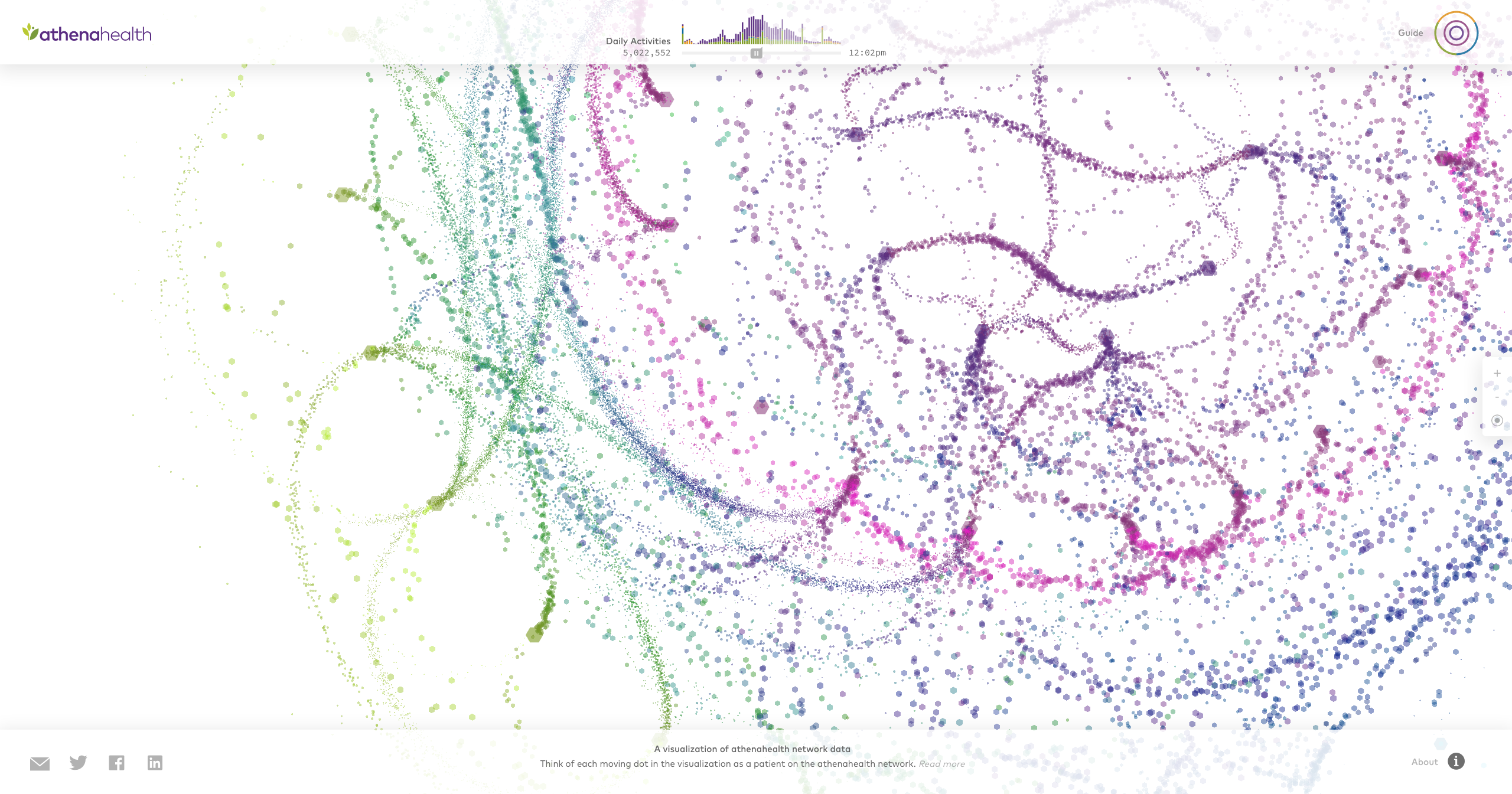
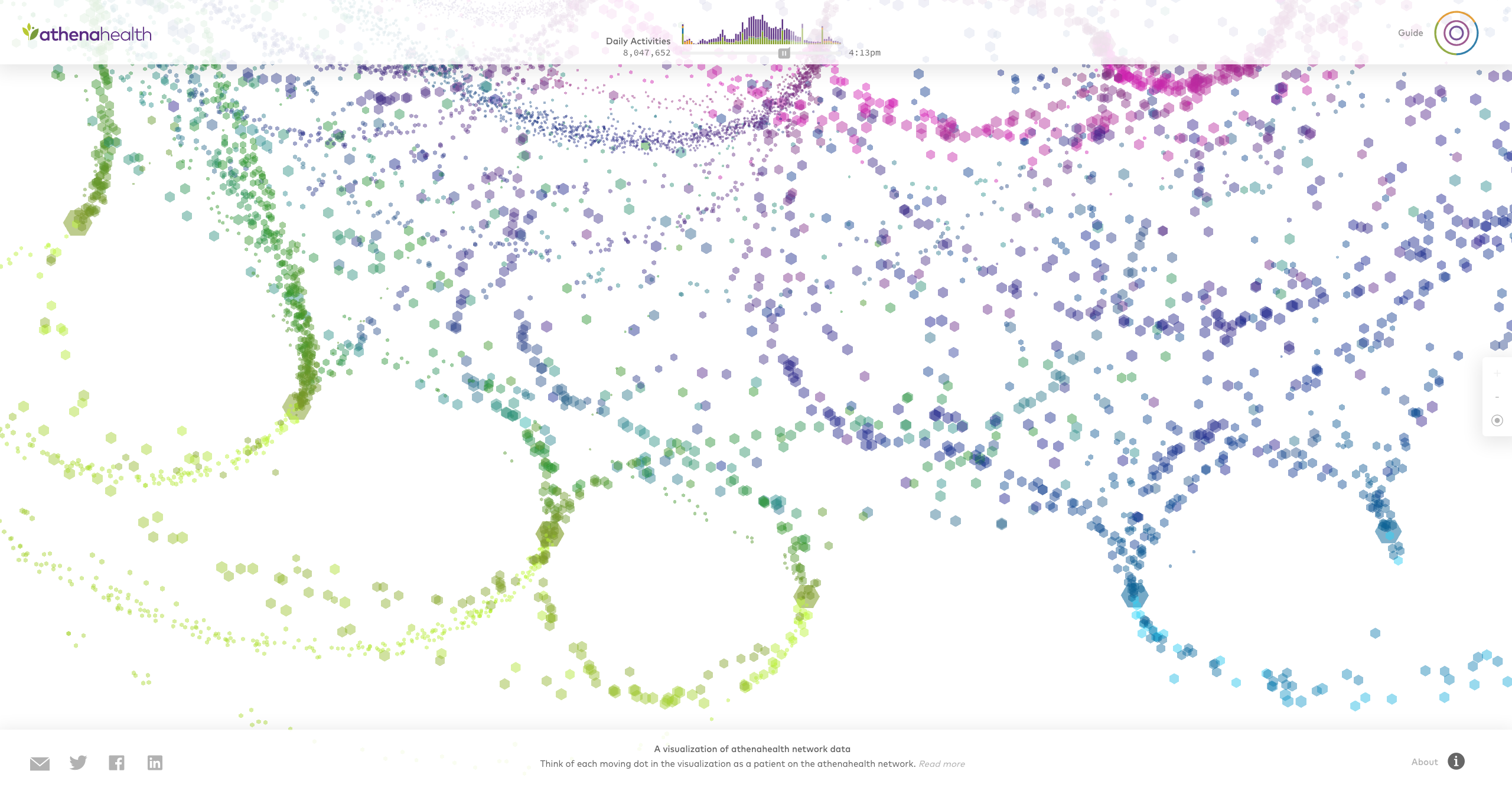
In partnership with athenahealth, Fathom created a visualization that shows how patients move through their healthcare network. We worked with athenahealth to develop a visual language that spoke to their brand and the high level of activity within their network they wanted to convey.
Capabilities
- Rapid prototyping
- Installation application development for long runtimes
- Front-end and back-end implementation
- Design of installation, visual interface, and data-driven interaction
Challenges
- Convey the real-time nature and complexity of athenahealth's network without being overwhelming
- Enable users to follow a path of activity through the athenahealth network
- Create a piece that works well for a lobby space, and is both interesting to watch or explore
Actions
- Built a robust application that could be left on for long periods of time, suitable for a lobby installation
- Provided guidance on procuring and setting up a machine to run the installation
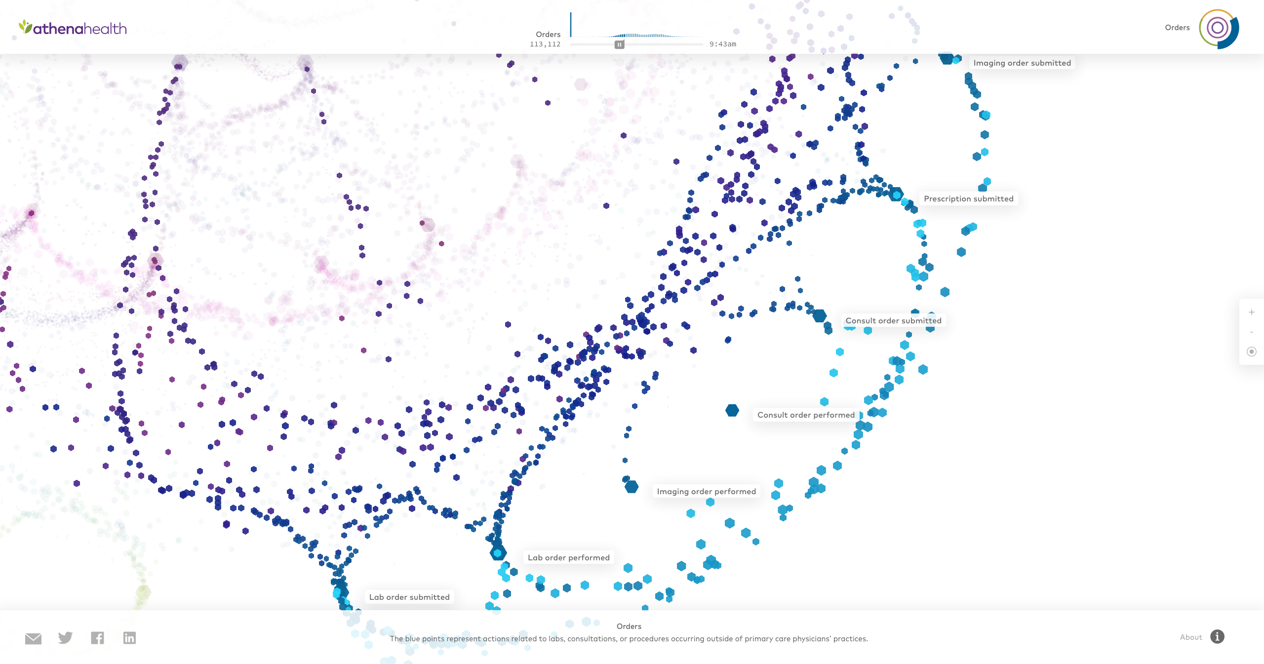
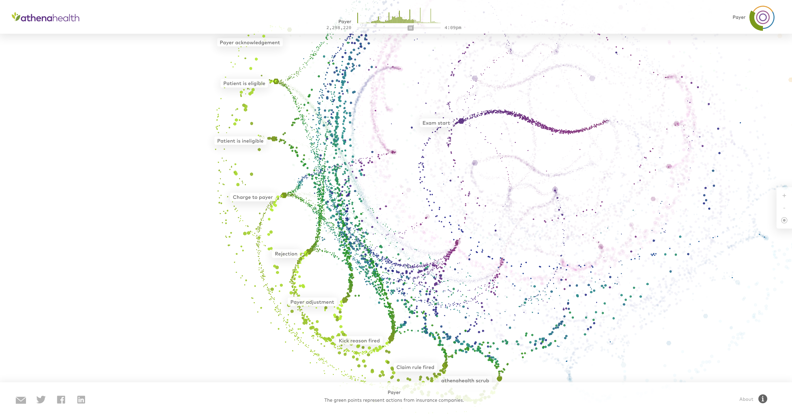
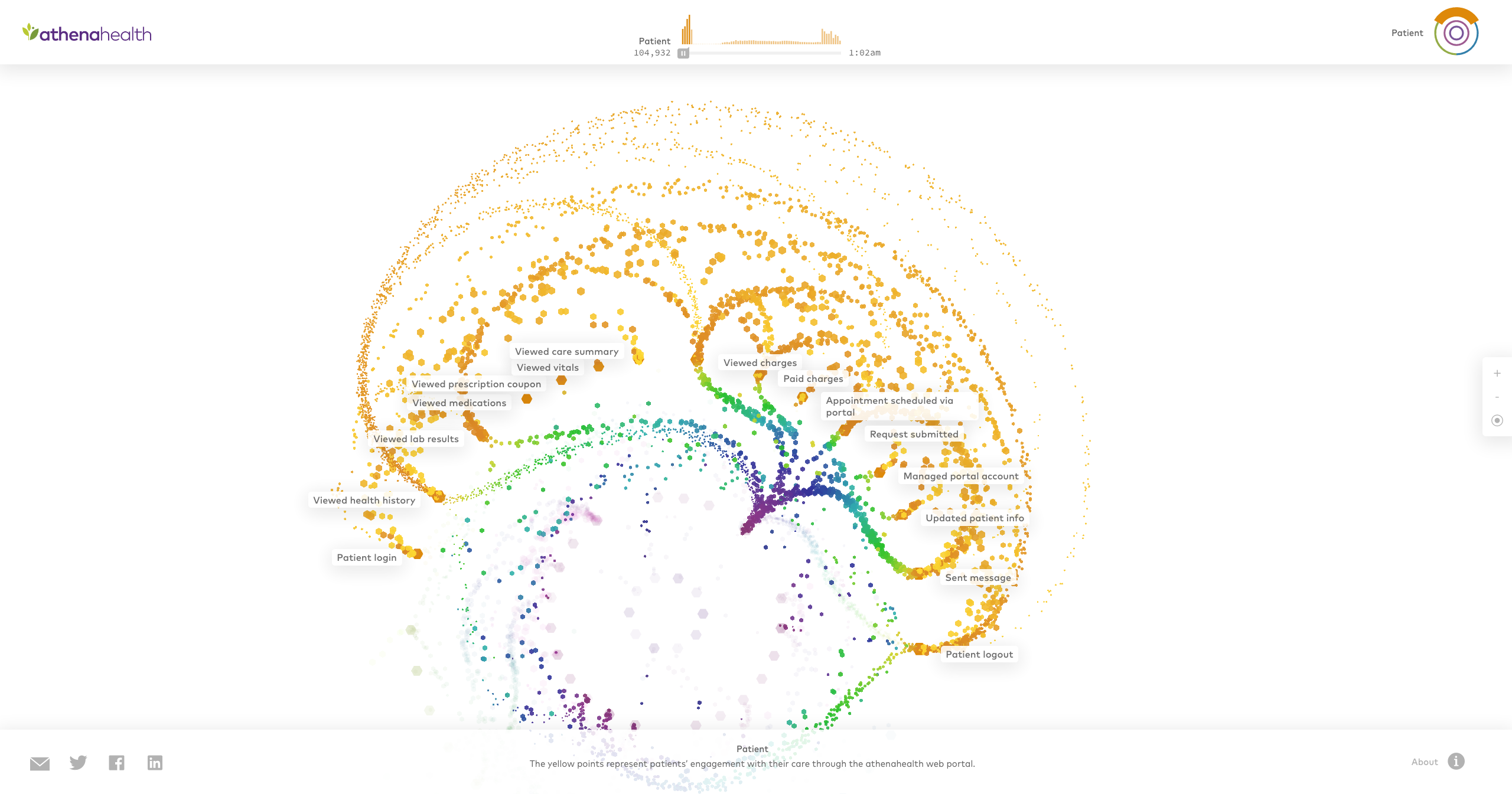
The interactive application depicts more than ten million patient-to-healthcare interactions over a single day. The graphic shows athenahealth's services, broken up into four color coded parts: from the first office visit (purple), to a patient’s activity on the web portal (orange), to labs and order transactions (blue), and then to processing of insurance claims (green), depicting activity across their entire network.