
F
Trees, in a forest, much like the many trees that Delphy creates. Except those are phylogenetic.
k
Let your forest grow: a non-technical guide to Delphy, part 2
Now that we know what to expect from the data, how do we run this thing?

This is part 2 of our series on the complexities of the data behind Delphy, our tool for understanding the evolution of pathogens during an outbreak. In part 1, we describe the type of data Delphy generates. If you haven’t already, it’s probably helpful to read that first. As a reminder, the main takeaways are:

  • Delphy takes the genetic sequences of a pathogen sampled from infected people during an outbreak, and makes a phylogenetic tree (basically, a family tree of the pathogen).
  • The process for this is to generate a lot of equally plausible phylogenetic trees, and then summarize all these individual samples.
  • If a feature shows up consistently across all the plausible trees, then it’s likely to be a real thing.
  • Since all the trees are equally plausible, it doesn’t make sense to just show one result. Instead, Delphy shows a distribution of results from all the plausible trees.

In this post, we’ll describe how to launch a Delphy run and what that looks like. Which, by the way, is very different from what you get with other tools for Bayesian phylogenetics. They run from the command line, so you might get some readouts on the screen or there might be a log file you can parse to evaluate progress. But since there’s no insight into how it’s progressing, people tend to set the job for a predetermined number of trees, wait hours or days until it’s done, and then take a look at the results. If you happened to have some bad data, that’s a lot of time wasted. In Delphy, the same screen that launches the run has numerous indicators of how the job is progressing. And you can pause the job at any moment to check the data, and restart it if all looks good.

Watching the evolution of the tree

After sequences are uploaded and parsed in Delphy, you are automatically taken to the “Trees” tab.
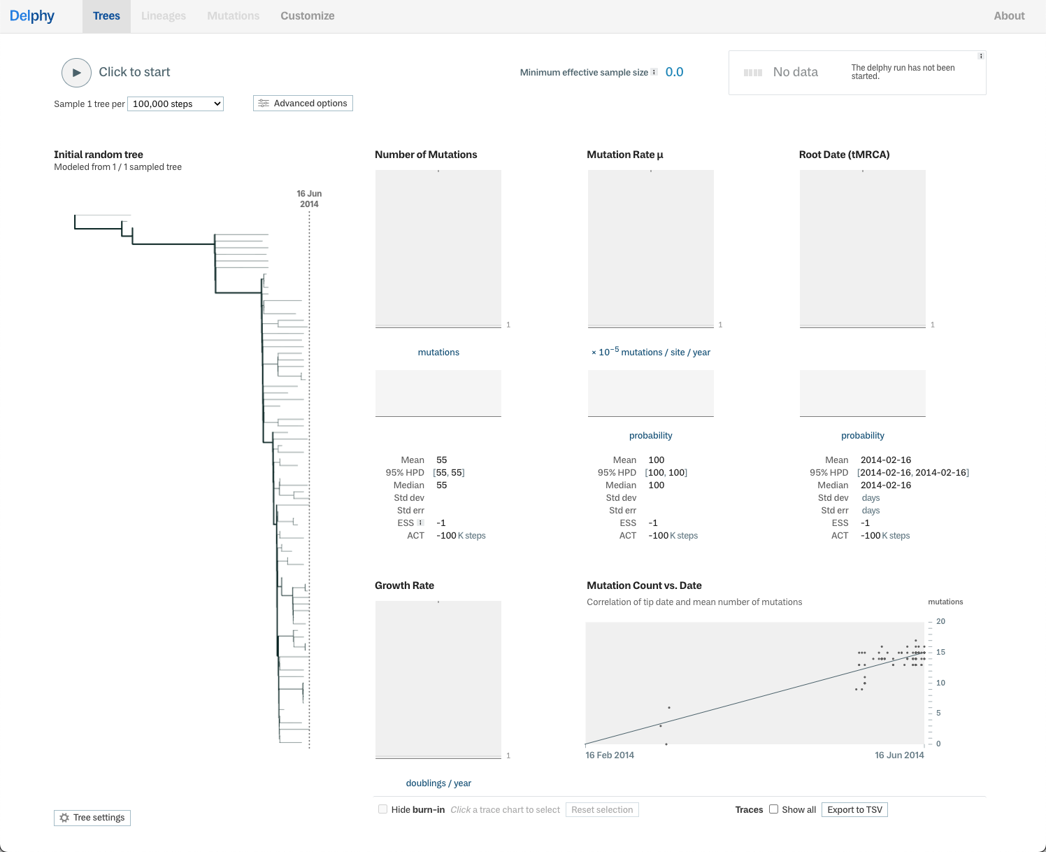
A screen shot of the run tab in Delphy, most dark grayscale text on a white background. At the top is a row of controls and readouts, including a play button labelled 'Click to start', a drop down to set the sampling rate, a button to launch advanced options, and towards the right a readout for 'Minimum effective sample size: 0' and a status block indicating there's no data yet. Below that row are 1) a phylogenetic tree on the left, and 2) a set of charts that we call 'trace' charts. The tree and trace charts will be described in more detail below.
The Trees tab in Delphy before the run starts. Here you can set parameters for a run by clicking the “Advanced options” in the upper left, start and pause the run, and monitor its progress via trace charts and other indicators on the page.

On the left side, you get to see a first guess of what the evolution of the pathogen looks like. Delphy shows an initial tree, with the root in the upper left, branching towards the right. Each tip where the branches come to an end represents one of the uploaded sequences. Until the user presses the run button (it looks like a play button), we only have this one tree1.
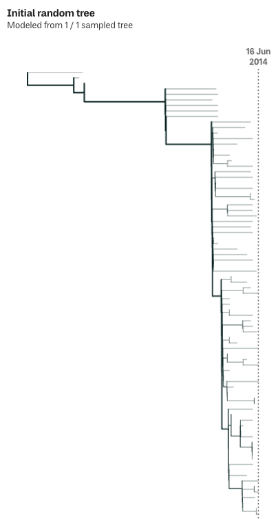
A phylogenetic tree labelled 'Initial random tree', drawn with black lines on a white background. The tree starts in the upper left, and each branching point has exactly two branches. Each branch is connected to its parent by a vertical bar from the parent (one up, one down), that then turns 90° to the right. The horizontal segment of each branch is of different lengths. The branches get much denser in the right half of the diagram. The lines making up the branches get thinner as the tree gets denser. The overall shape starts at the top left, expands a bit downwards as a few more branches are added, and in the last quarter of the diagram, cascades organically down to the right, until it spans the entire height of the diagram. At the right edge of the diagram, aligned with the tip of the rightmost branch, is a dotted line labelled '16 Jun 2014'.
The initial tree for a Delphy run. The date on the right marks when the last sequence for this run was collected. The layout of the tree is pretty good already, but it will only get better as once the run starts and we begin iterating on it. Those iterations are behind the depth of the data that Delphy generates.

In the app, to the right of the tree, there are charts for various “traces” generated during the run. Each trace is a particular measure of a tree, and the charts track that measure across all the base trees that Delphy generates. For example, since each base tree is a take on the evolution of the pathogen, we get a mutation rate for each one of those trees. The “Mutation Rate μ” trace chart allows us to see all those rates together and compare them across the entire Delphy run. Most of the traces have two charts: a seismograph-like chart showing the values for each base tree (there’s only one value at the start), and below that, a distribution that summarizes the values. They start with only one value each, but they fill up as the run progresses. All together, these traces help evaluate the progress and quality of the run.
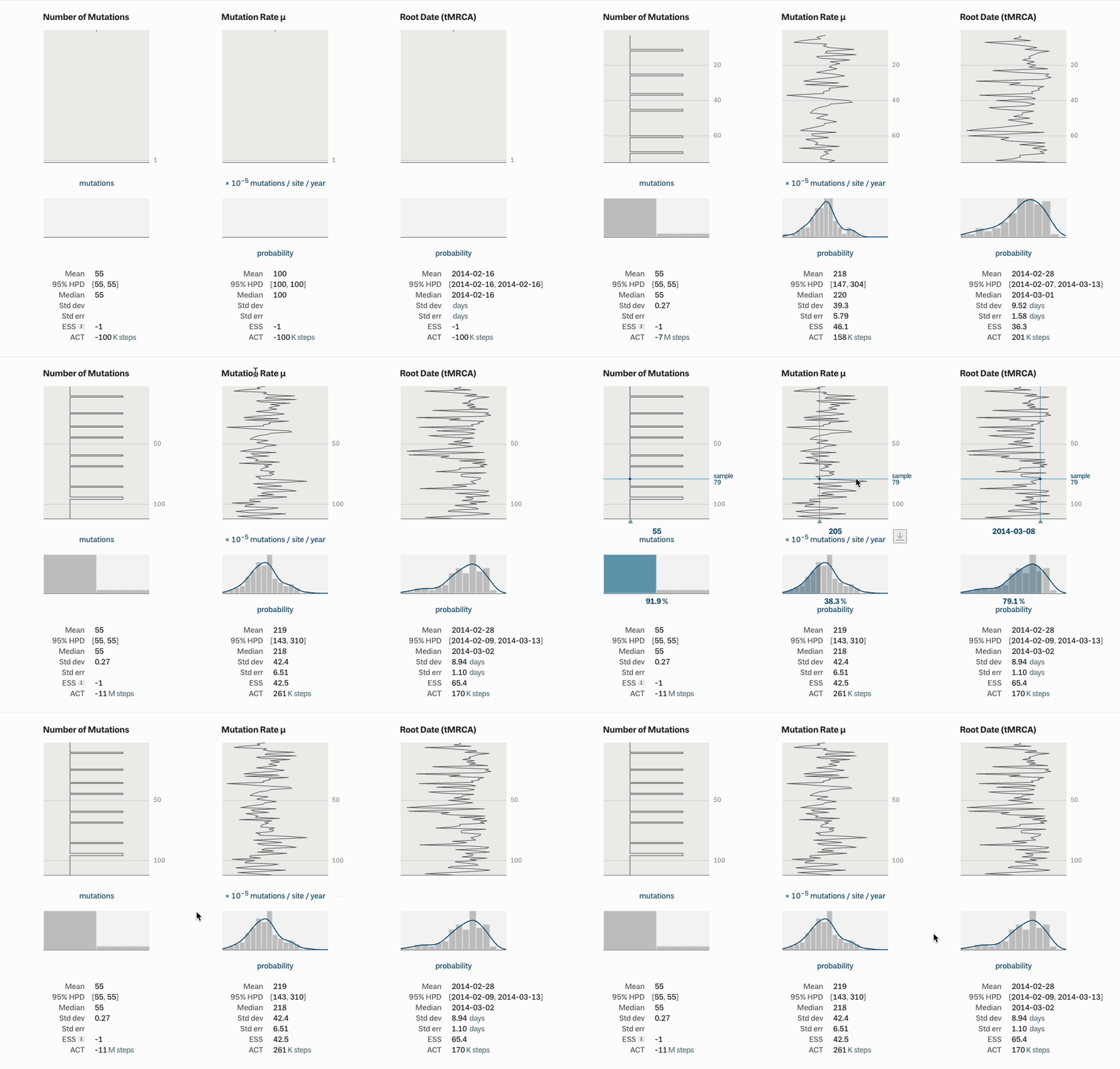
A looping video of three trace charts, labelled 'Number of Mutations', 'Mutation Rate μ', and 'Root Date (tMRCA)'. Each trace chart has three parts aligned in a column: a tall light gray rectangle, a short gray rectangle, and a list of summary statistics: Mean, 95% HPD, Median, Std dev, Std err, ESS (for 'Effective Sample Size'), and ACT (). The gray rectangles are nearly empty: the upper rectangle has a dark line at the bottom with a '1' next to it (outside the chart on the y axis); the lower chart also has a line at the bottom. When the run starts, a line series starts moving up each of the upper charts: new values are added to the bottom, pushing the older values towards the top, much like the readout on a seismograph. When the series reaches the top of the rectangle, they don't move off: instead the data gets denser to make room for the new values. Each of the shorter charts has a histogram that reflects the distribution of the values in the upper chart. Additionally, in the 'Mutation Rate' and 'Root date' charts, a sum probability curve is drawn over the histogram to reflect the continuous nature of these values ('Number of mutations' is measured in discrete integers, the others are decimals). The statistical values at the bottom also update to reflect the latest data. After about four seconds, new data stops flowing into the charts. Shortly after, the mouse enters the screen and moves over the central upper chart: as it moves down, it highlights the values in the line series at the same vertical position–not only on the center chart, but across all the upper charts. Simultaneously, the value is highlighted in the histograms below: in the 'Number of mutations' chart, the histogram bucket corresponding to the value is highlighted; in the others, the probability curve is filled in up to the corresponding value.
Trace charts filling up with data as a Delphy run starts. Offscreen, the user pauses the run and then the mouse comes back to inspect the mutation rate values so far.

There’s another chart besides the trace charts, and it starts off full of useful data. This is the scatter plot in the lower right, labelled “Mutation Count vs. Date”. It compares the date of each uploaded sequence with the number of mutations in that sequence, along with a linear regression. A quick glance at this will help determine whether you have outliers that you may want to remove from your data. For example, in the example below, it’s clear one of these dots is not like the others:
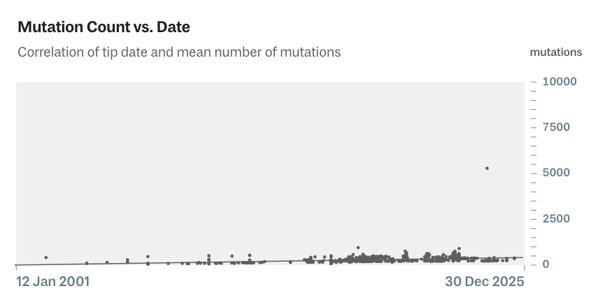
A picture of a scatter plot with a linear regression. The x-axis is labelled  '12 Jan 2001' on the left and '30 Dec 2025' on the right. The y-axis is ranges from '0' at the bottom to '10000' at the top. The line of the regression starts in the bottom left corner, and extends to the right side rising only a few pixels from the bottom, roughly corresponding to a y-axis value of 500. There are roughly eighty dots crowded across the bottom, more on the right than the left, the highest reaching a value of less than 1000. Apart from those is a single dot whose value appears to be a little over 5000.
In this scatter plot, most of the data hugs the bottom of the chart, along with the linear regression. One sequence stands apart from all the others, with roughly five times the mutations of the rest. Hovering the mouse over that dot will reveal the id of the sequence, so that you can find it in the input data.

Once the run actually starts, things get much more interesting. Note that it’s way more fun to do it yourself: just go to delphy.bio, select the “Ebola: Gire et al 2014” demo, click the “Run this demo” button, and then click the run button, like this:
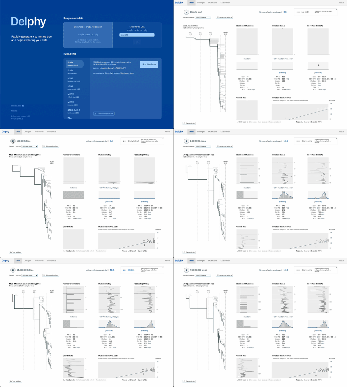
A looping video of Delphy. It opens on the loading screen, a blue field with white text. The user clicks a button corresponding to one of the demo files, and then clicks a button labelled 'Run this demo'. The background color changes from blue to white, and 'Trees' tab (described above) is displayed. The mouse moves to the 'Click to start' button at the top and clicks it. The trace charts update as described above. Additionally, the phylogenetic tree also changes shape with each new sample. Whereas the overall shape of the initial tree mostly stuck to the top and right side of the diagram, it fills up more of the space and many of the vertical bars that connect branches get longer. At first the shape grows dramatically, but it soon calms down: it jiggles a bit but remains mostly stable. In the upper right, the 'Minimum effective sample size' number grows from 0 up to about 26, but it pops up and down a bit along the way. The status label goes from 'No data' to 'Converging' to 'Stable' as well.
A video loop of starting a Delphy run: once the user opens the demo, you see a phylogenetic tree on the left, and the trace charts to the right of it. Once the user clicks the run button, the trace charts fill up with data, and the phylogenetic tree changes shape as new samples are added.

Behind the scenes, Delphy starts generating base trees. Every time a new base tree is sampled, the phylogenetic tree changes shape and each trace chart updates with a new datapoint. Beneath each of seismograph-style charts, the distribution updates to include the new value. In an older version of Delphy, we showed each new tree as it was generated. It helps express how the process works, but it’s not actually that useful, so we took it out to make space for better trace charts.
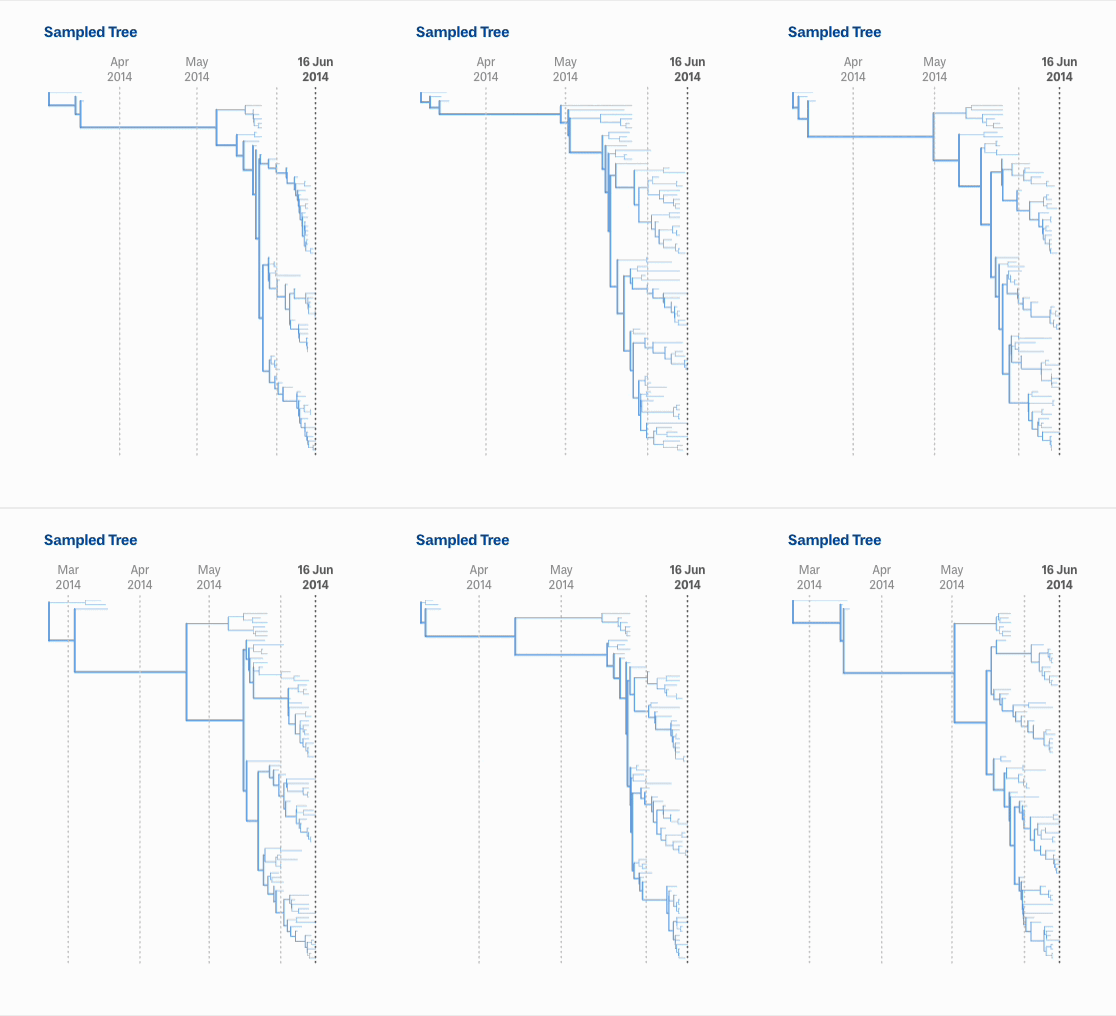
A looping video of a phylogenetic tree, this time drawn with blue lines. It frantically changes shape, always going from the top left to lower right, but each frame has a slightly different arrangement of branch lengths and vertical spacing.
Looping view from an earlier version of Delphy, displaying each new sampled tree as soon as it is generated. Although each tree is different, you can see that they all have roughly similar shapes.

There’s a general pattern to how the phylogenetic tree on the left updates during a run: it changes dramatically for a bit before it settles down. Recall that the goal of the algorithm is to create a bunch of equally plausible sample trees. The first tree you get is pretty good, but it’s still somewhat random. It can take a bit of the run to reach an equilibrium. This is reflected in the how much the phylogenetic tree changes with each sample: as the run approaches an equilibrium, the phylogenetic tree becomes more stable 2.

As we get more and more of the sample trees, we want to see what parts of the tree show up consistently. We use a “Maximum Clade Credibility” tree 3,4, one of the conventional ways to show those common features for data like this. Basically, every branching point is evaluated to see how many of the base trees it appears in. The ones that appear in 90% or more5 of the base trees are colored darker.
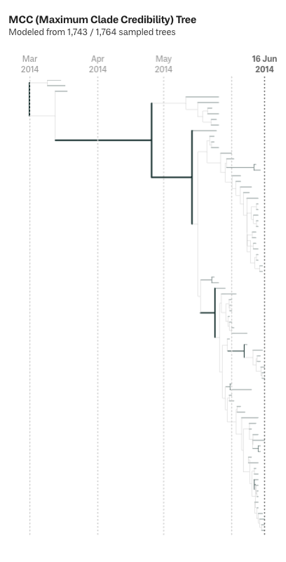
A diagram of a phylogeneti c tree labelled 'MCC (Maximum Clade Credibility) Tree'. Most of the lines are grey, though a few are drawn in black with a slightly thicker line. These correspond to the branches in the tree that appear in more of the base trees.
The MCC, with the high confidence branches drawn in black. Those are the branching points that we can be pretty sure correspond to the evolution of the pathogen in the real world.

With Delphy, our goal was to create transparency into all the data behind the phylogenetic tree. During the run phase of Delphy, having visibility into all the traces can help experts get fine grained detail on the run’s progress. For non-experts, we also have a simpler way to tell how the run is progressing. In the top right of the tab, there’s a progress meter indicating how reliable or robust the run is so far. This summarizes the trace data and tells you whether it’s too soon to start exploring, good enough to vet your data, robust for exploration, or so stable that it’s really unlikely to change any more.

Zooming in on the progress summary in the upper right of the run tab. There is a label 'Minimum effective sample size' with a readout of 24.6. Next to that is a box that contains three elements: a power meter of four slots, two of which are filled; a large label reading 'Stable', and a short paragraph reading 'Ready for initial exploration. Running longer will refine results.'.
The quick read of a run's progress. The Minimum effective sample size is a statistical measure of whether there's enough variation in the base trees (which is not the same as the number of trees). That’s linked to the status on the right: under 15, there's not enough data to draw any conclusions. Other thresholds are at 15 and 200, and once it reaches 200, the run has gone long enough that it's unlikely to change any more.

Our recommendation is to pause the run once the results are stable. Then open up the other tabs to take an initial look at the results. This can highlight bad data in the sequences that were uploaded to Delphy. If you find some, it could be worthwhile to remove that sequence and start another run–and because Delphy is so quick, that’s not a costly thing to do. But if everything looks good, then you can go back to the trees tab, unpause the run, and wait a few more minutes for the results to become robust. We’re hoping that having such a quick and easy tool will encourage more people to explore phylogenetic data on their own. In the next part of the series, we’ll walk through the sorts of analysis you can do in Delphy.

Notes

  1. We don’t start generating new trees right away, as the user may want to set some different parameters for the run.
  2. Note that the tree will continue to update sporadically as the run continues.
  3. “Clade” is the technical term for a tree or subtree, and when we look for common features across trees here, we are looking for clades. For the purposes of this algorithm, Delphy identifies clades by all the tips / sequences that are descendants of a branching point–the details of the branching structure don’t matter, just the tips. To build the Maximum Clade Credibility tree, Delphy 1) identifies all the clades in all the base trees, 2) scores each clade according to how many base trees it appears in 3) scores each base tree according to the clades it has 4) takes the structure of the highest scoring tree (the one with the highest clade credibility) 5) adjusts the branch length for each clade in the tree according to the average time of the clade across all the base trees it shows up in.
  4. There are other kinds of summary trees, and we’re looking forward to incorporating them into Delphy in the future.
  5. You can adjust that percentage by opening up the Tree Settings below the tree.

We’d love to hear what you’re working on, what you’re curious about, and what messy data problems we can help you solve. Drop us a line at hello@fathom.info, or you can subscribe to our newsletter for updates.