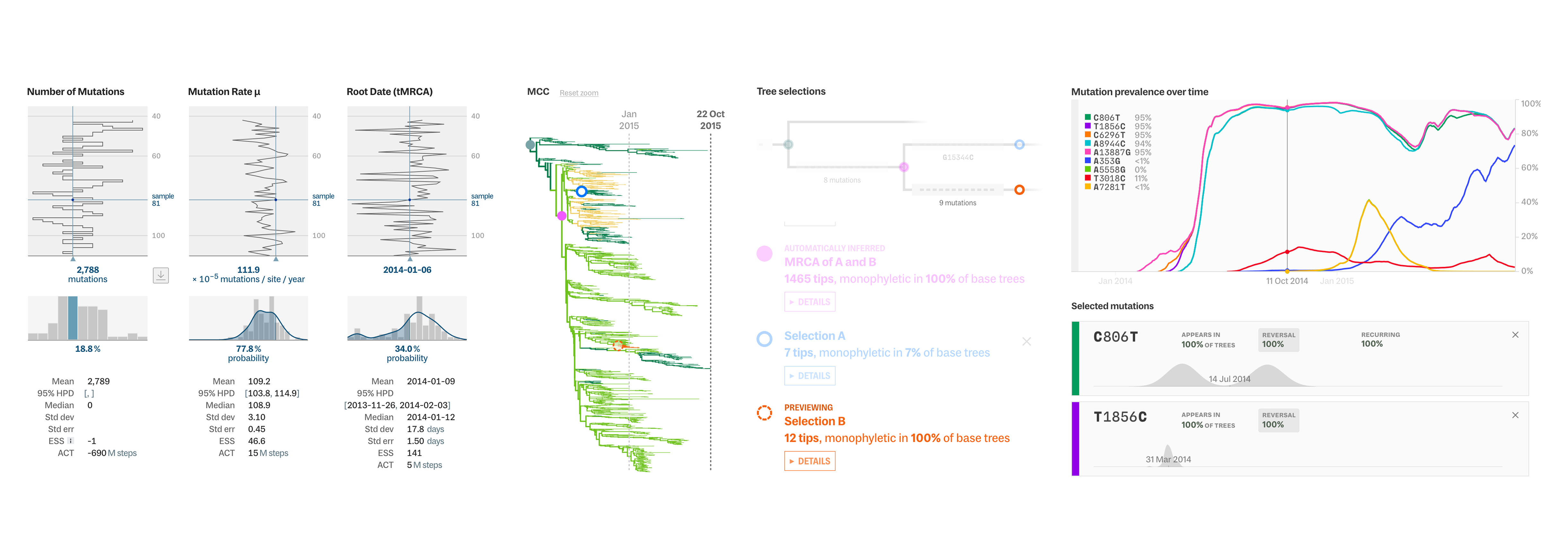
We’re super excited about Delphy getting published in Nature. Delphy is our state-of-the-art outbreak tool to track viral evolution, and it runs in a web browser. Previously, similar tools were limited to researchers with enough time, expertise, and computing resources to run them. Delphy puts the same methods within easy reach of a whole new audience, and that’s why we built it. As part of the Sentinel effort, we want to empower public health departments with the insights that help them develop the most effective outbreak response they can. All the same, the methods behind Delphy1 result in complex data that are not immediately intuitive if you don’t know what’s going on. We figured it could be useful to offer a description that’s not too technical. Our goal is to simplify in order to shine a light on how to use Delphy, but not oversimplify so much that it becomes misleading.
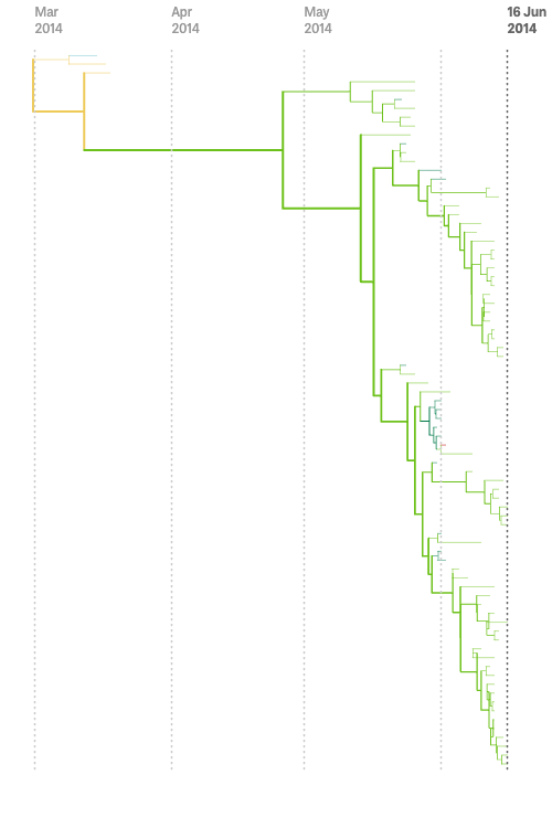
The easiest way to visualize the evolution of a pathogen is to draw its family tree, and that’s one of the primary outputs of Delphy2. The technical term is “phylogenetic” tree, and it describes the evolution of the pathogen, and allows us to see what mutations occurred and when they occurred. Some branches of the tree represent different variants, which are basically defined by the mutations behind them. And some of these variants can be different enough that they launch a whole new wave of infections. Remember the Delta and Omicron waves of Covid? Each of those variants were caused by the accumulation of mutations during the evolution of the SARS-CoV-2 virus.
The starting point is a bunch of genetic sequences of a specific pathogen. These will have been collected from infected individuals, and each sample is individually sequenced to get its DNA; that is, all the combinations of A, C, G, and T that make up its unique genetic identity. Each sequence is dated, and once we gather enough sequences, we upload them into Delphy. One thing that is important to note is that we never have a complete record. There are people who passed on the disease who never got sampled, so when we build the family tree, we have to guess at all sorts of viral parents and grandparents, cousins, aunts and uncles, etc. Those fill in the branches of the tree, and the sequences we do have are the leaves of the tree.
From here, it’s easy for Delphy to arrange the sequences into a phylogenetic tree. The trick is making it a plausible tree. That begs the question: what makes the tree plausible? Thankfully, there’s a straightforward answer: a tree with fewer mutations is more likely than one with more mutations. To illustrate, here is an excerpt of some of the sequences in one of the demo files for Delphy:
acctacaag
acttacaag
acttacaag
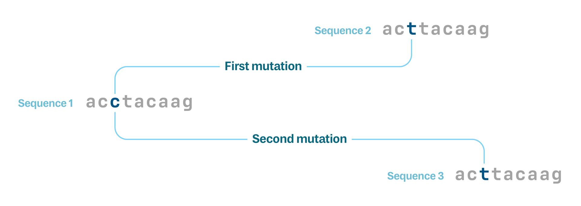
The first sequence was taken early on in the outbreak, and the next two happened a while later. Notice that the third letter of the first sequence c is different from the corresponding letters in the later sequences t. There are two ways this could happen:
a) the mutation happened twice: after the first sequence came a few unsampled descendants, and the mutation occurred in two of those descendants independently.
b) the mutation happened once: after the first sequence, the mutation occurred in an unsampled descendant, which passed it down to the other sequences.
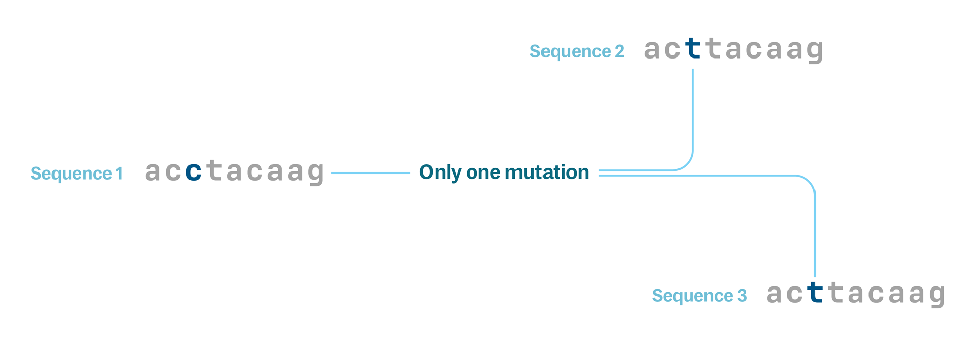
The second option is much more likely. The chance of the same mutation occurring independently more than once is pretty unlikely, though not impossible. In general, a mutation happening once makes for a simpler explanation, and this simple rule is a key driver of the way Delphy assembles a plausible tree.
The thing is, if you have one plausible tree, that doesn’t mean it’s the only plausible evolution of the pathogen. There could be other plausible explanations as well. For example, even if we go with option b above, maybe there was only one generation between the first sequence and when the mutation occurred. But maybe there were two, or three, or nine?
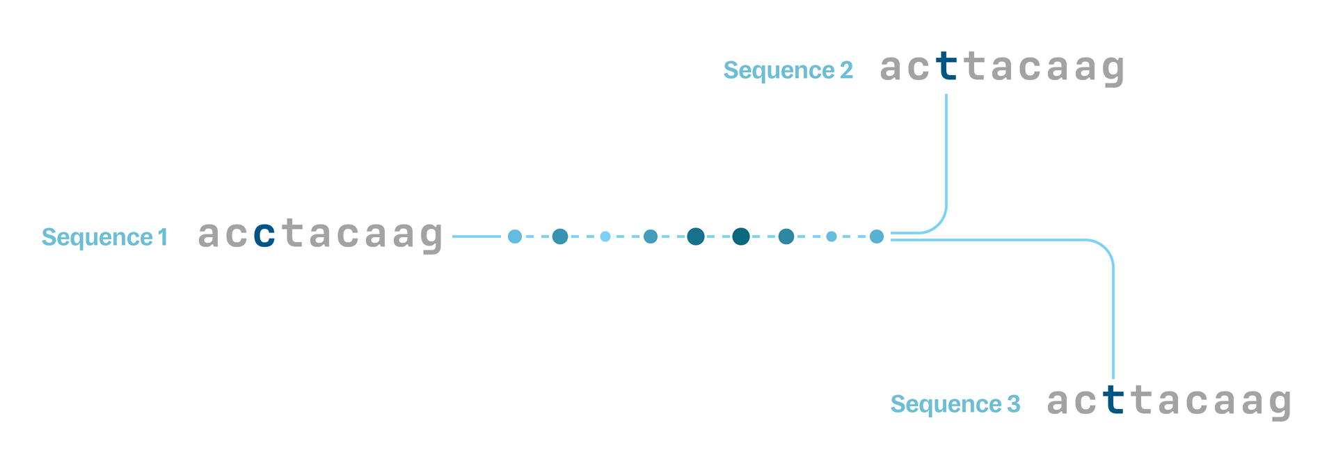
Each is equally plausible. So Delphy doesn’t stop with one tree: it generates dozens, hundreds, or even thousands of equally plausible trees3,4.
How does having all these possible guesses help us? Each tree is different, each offering a different description of how the pathogen evolved. But after you look at enough of them, you’ll notice common patterns among them. This is a key insight of the sort of analysis Delphy does: if every reasonable explanation tells you the same thing, than it’s likely that thing is true. Delphy surveys all the plausible trees, evaluating features of those trees to see how often they show up. Then it highlights the ones that are most common, and reports on just how likely they are. It doesn’t just give you an explanation, it gives you the tools to see for yourself how reliable that explanation is.
That’s the core idea behind how Delphy generates data for analysis. It makes many plausible trees, looks for features common to all (or most) of them, and when answering questions about the data, it gives a distribution of numbers as opposed to just one. What does it look like in the application? We’ll explore that in part 2 of this series.
Notes
- The actual statistical methods are Bayesian inference and Markov Chain Monte Carlo (often shortened to “MCMC”, hence the title). At the heart of it, statistics can answer questions along the lines of, “How likely is this thing?” Common methods in phylogenetics (such as maximum parsimony, maximum likelihood) tend to give a single answer to a question (maybe with an indication of how robust the answer is). Bayesian statistics will give a full distribution for the unobserved viral spread and evolution, which can be way more informative. Part of the process is building a model for how that full distribution depends on some input parameters. Markov chain Monte Carlo is one way of efficiently drawing samples from that distribution: Monte Carlo refers to the process using random numbers, while the Markov Chain aspect refers to the slow evolution from one random sample in the distribution into another.
- And the programs like it, such as BEAST X, or Beast2: the general strategy described here is used by all these programs. Each of these programs has implementation specifics that make it unique, but they all employ the same class of algorithm. From here on in, where I say Delphy, it can mean any of these.
- Actually, Delphy often generates millions upon millions of trees, but many of them are so similar that it only saves one out of every hundred thousand, or million, or ten million, etc. This is a parameter that you can set in a Delphy run.
- In the Delphy interface we call these “base trees”, though statisticians might refer to them as “posterior samples”.
We’d love to hear what you’re working on, what you’re curious about, and what messy data problems we can help you solve. Drop us a line at hello@fathom.info, or you can subscribe to our newsletter for updates.