The On Being Project
Creating a new way of understanding 14 years of conversations
Capabilities
- NLP and text analysis
- Front-end and back-end implementation
- Design of desktop and mobile experiences
This was originally shared as a post on Medium that describes our process in depth, through the story of our partnership with On Being.
Of a career spent interviewing and listening, Krista Tippett writes, “I’ve come to understand the cumulative dialogue of my work as a kind of cartography of wisdom about our emerging world.” Tippett has hosted the award-winning radio show and podcast On Being for the past 15 years, inviting guests from Janna Levin to John Lewis to Rosanne Cash into her studio for conversations covering everything from art and science to philosophy and faith.
We were contacted by the co-founder of On Being, Trent Gillis, about a year ago. He attended an Eyeo Festival presentation of our work and wrote, “I thought that Fathom might be the right partner for us to think through our questions and ideas (which are much richer and more abundant than any answers we have).” This is what we love to hear—someone who wants to think with us.
A few weeks and a couple phone calls later, we had a loosely defined project plan around understanding the incredibly rich On Being archive. The discussions gave us an understanding of their audience and how Krista and Trent saw their work; we had some data in hand and were eager to get moving.
Early Sketches
Armed with a spreadsheet with a list of URLs for each individual episode, we wrote some code to automatically download each web page, extract the interview texts, clean them up, and put them in a format that we could use for data analysis and creating initial sketches.
On our first call, Trent said they wanted “ways that we might welcome people in,” which we felt was enormously important. We never want to create something that, like so much “dataviz,” is mostly catered to people who like a particular aesthetic, and are comfortable with forms and visual abstractions that are unfamiliar to most people. This meant throwing out more ideas than usual, and also that any early concepts would require several iterations before they were ready for a broader audience.
We usually create hybrid tool-prototypes in the early stages of our work. Their point is to help understand the data, so the level of design might be unrefined, but they give us a way to unpack what’s inside the data, and see how it might be translated into visual forms. Sometimes the final result evolves out of a tool we created along the way, though more often, the tool gets thrown out once we’ve used it to determine what’s most compelling. Then we we start from scratch with that new understanding of the data, now mapped to a specific kind of exploration or story.
We started looking at words found most often, and those used together most frequently. Each episode was shown as a dot at the right, with one episode being currently selected. The words for the current episode were shown in a list at the left. The list was ordered by the frequency of each word, with tiny bar graphs next to each to show proportion.
The dots were arranged by calculating the linguistic similarities between the episodes. Clicking on a dot made it the “current” episode, rearranging the dots and updating the word list in the process. Hovering over individual episodes also highlighted words that contributed to the similarity score between that episode and the current selection. This felt like a worthwhile direction because it built off something Trent said about wanting to find “strange adjacencies” between episodes.
That iteration, of course, is too obtuse to put in front of people, but helped us begin to understand how the episodes connected with one another. We iterate in a sort of tick-tock process: alternating between progress like this on the technical side, and more design-centric updates that strip away extraneous analytical details once we have a better sense of what we’re trying to say.
So a couple iterations later, a visual design approach started to emerge, and the diagnostic details were removed. Behind the scenes we also made progress in how to consider relationships between episodes from an algorithmic standpoint.
This iteration was easier on the eyes, and added short phrases unique to each episode that revealed a bit about the content. In a typical interface, a single podcast episode might be identified by features like title, date, or length, but those do nothing to pique your interest. Instead, the phrases provided a window into some of the conversation.
Our next call went well, and their team was excited to try it out. But late in the call there was a sort of pause.
Them: “Are you, uh, thinking these colors? And, uh, shapes?”
Us: “Maybe? I mean, they need some refinement but this was a direction we thought we might resolve…”
We liked the circular dots because it gave us an element that referenced the elegant “O” in their logotype, and how it was used as part of their identity:

But as it turned out, that “O” was itself a reference to the logo of American Public Media. It was an homage to their former home:
We looked at our animation and realized we had just reverse-engineered the APM logo. “Back to the drawing board” is an overused term, but pertinent here.
Time for a Detour
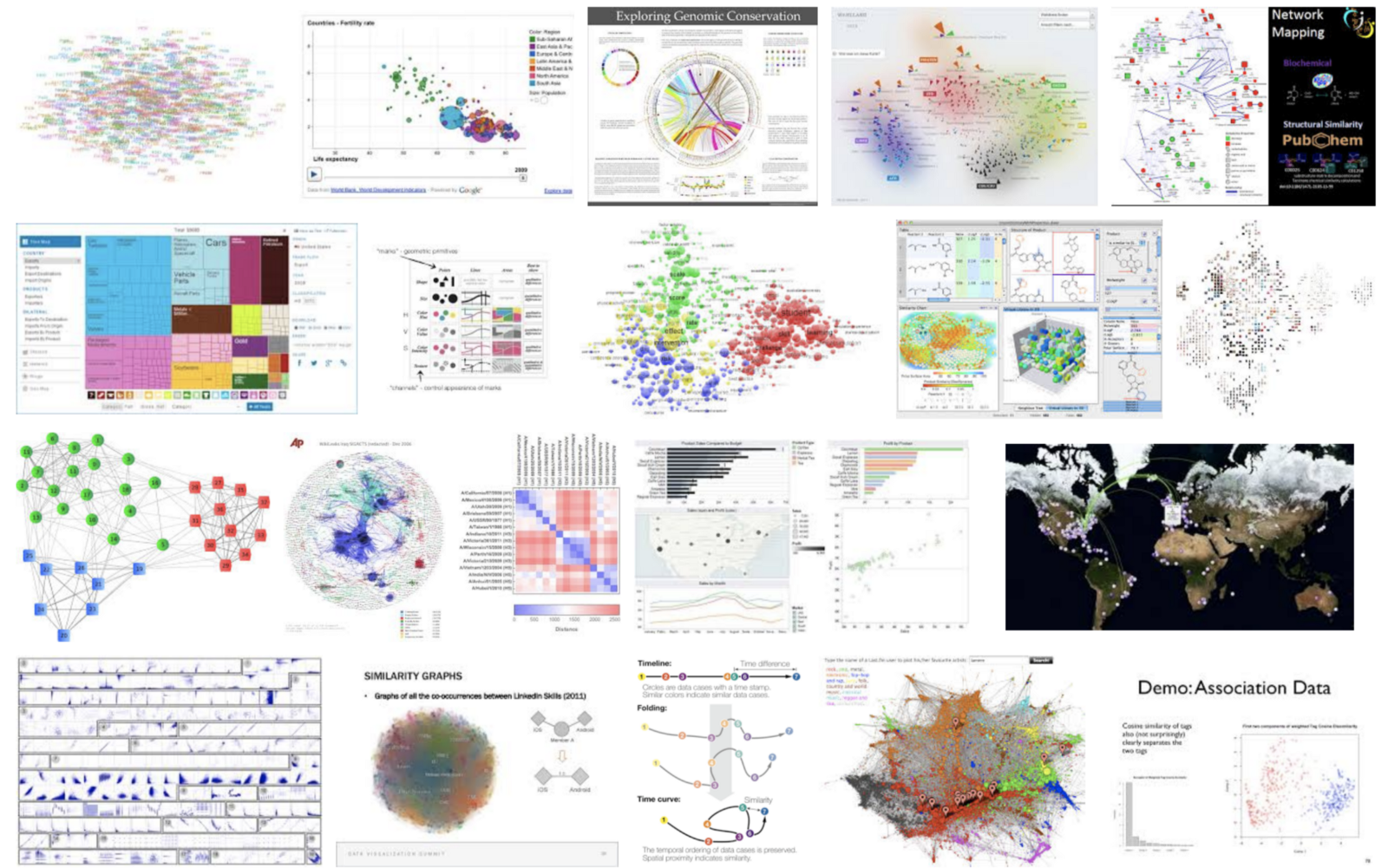
It wasn’t the end of the world, because we also felt the visual design was still too spare—neither welcoming nor unique, and the motion and layout of the dots was still too typical of this type of project. Do a quick image search for similarity data visualization and nearly all of the results are nodes moving about the screen, sometimes linked together by lines:
Looking for more texture and presence than abstract dots, we next moved to images. Each episode is published on the On Being site with a lovely, context-setting photograph, resulting in a trove of imagery that helps set the atmosphere of the episodes as a whole. We created an interactive piece that replaced the dots with images as the markers for the show and more explicitly added the names and titles for each.
But the result was a bit of a disaster. The hard edges of the images would be difficult to visually resolve, and more importantly, their physical placement failed to retain the feeling of relatedness. The swarm of images was both too cluttered and too spare. The space between and around the images was arbitrary and ugly. We tried filling the space with episode content to create some texture, but that was only more overwhelming:
The photos weren’t large enough to be enjoyed in a way that helped set the atmosphere, which meant their best attribute had been lost.
During that week’s internal crit, the phrase “late ‘90s photo browser” may have been used. Feelings may have been hurt.
Returning
Early in the project, we produced a poster from one of our early sketches. This three-by-four foot print remained on our conference room wall for the duration of the project, frequently attracting the attention of our visitors. Since that’s our lunchroom as well, we were reminded of the concept daily.
The poster sketch was built around the idea of identifying unique pieces of a discussion as a way to produce the sensation of overhearing a few words from a fascinating conversation. There’s nothing like the curiosity inspired by just the smallest piece of dialogue that opens a window into a completely different place.
We worked on a few iterations of algorithms that would identify unique passages. Then we took the first hundred or so episodes and laid out the highlighted phrases, along with the guest and title of each episode:
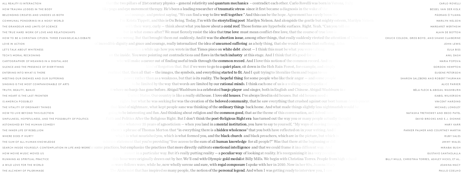
We also loved how these phrases on adjacent lines made haiku-like bits of poetry that set your mind spinning: Is this profound? Is it nonsense?
true love / abortion issue / unearned suffering
post-Religious Right / mental institution / hidden wholeness
human knowledge / emotional intelligence / peculiar way
It was an incomplete idea, but felt like another step toward those “strange adjacencies” sought by our partners at On Being. We built a simple interactive piece that we could use to jump between the unique phrases in each episode to make sure that the algorithmic selections weren’t just arbitrary:
While not given any visual design treatment, the interactive sketch helped reinforce the importance of the phrases, their ubiquity within each conversation, and how they might drive our final design direction.
Redirecting
A direction we received early on was to “make the material not so overwhelming.” We strive for this with any project, but it’s an incredibly difficult task when dealing with an entire archive. It’s also a contradiction: how do you get people excited about the breadth of the archive, while keeping them from being overwhelmed by…its breadth?
As we discussed further with Trent, he talked about the importance of new listeners finding their way through two or three episodes, and how important those would be as a door into the community. So we began to think about ways that we might connect a single conversation to just a few that had interesting relationships—what’s the right mix of similarity and uniqueness to make a compelling connection?
We also knew that we liked what the episode imagery brought to the piece. The photographs set a tone more appropriate to On Being than abstract graphics.
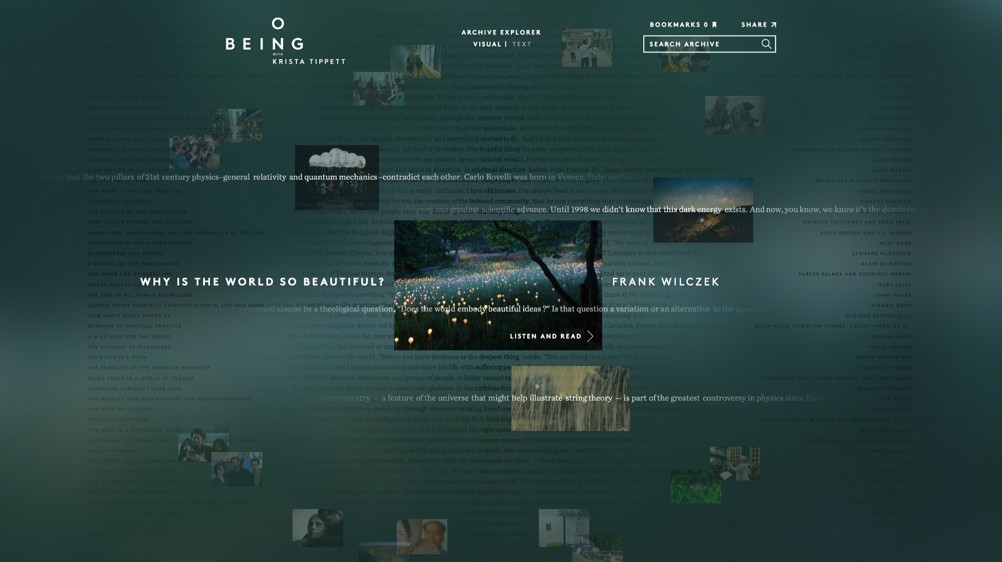
And finally, those whispers… those fascinating bits of overheard conversation. How might they be integrated? With these thoughts in mind, the team began to rework the design, and after a few iterations had something that felt like we were finally on track:
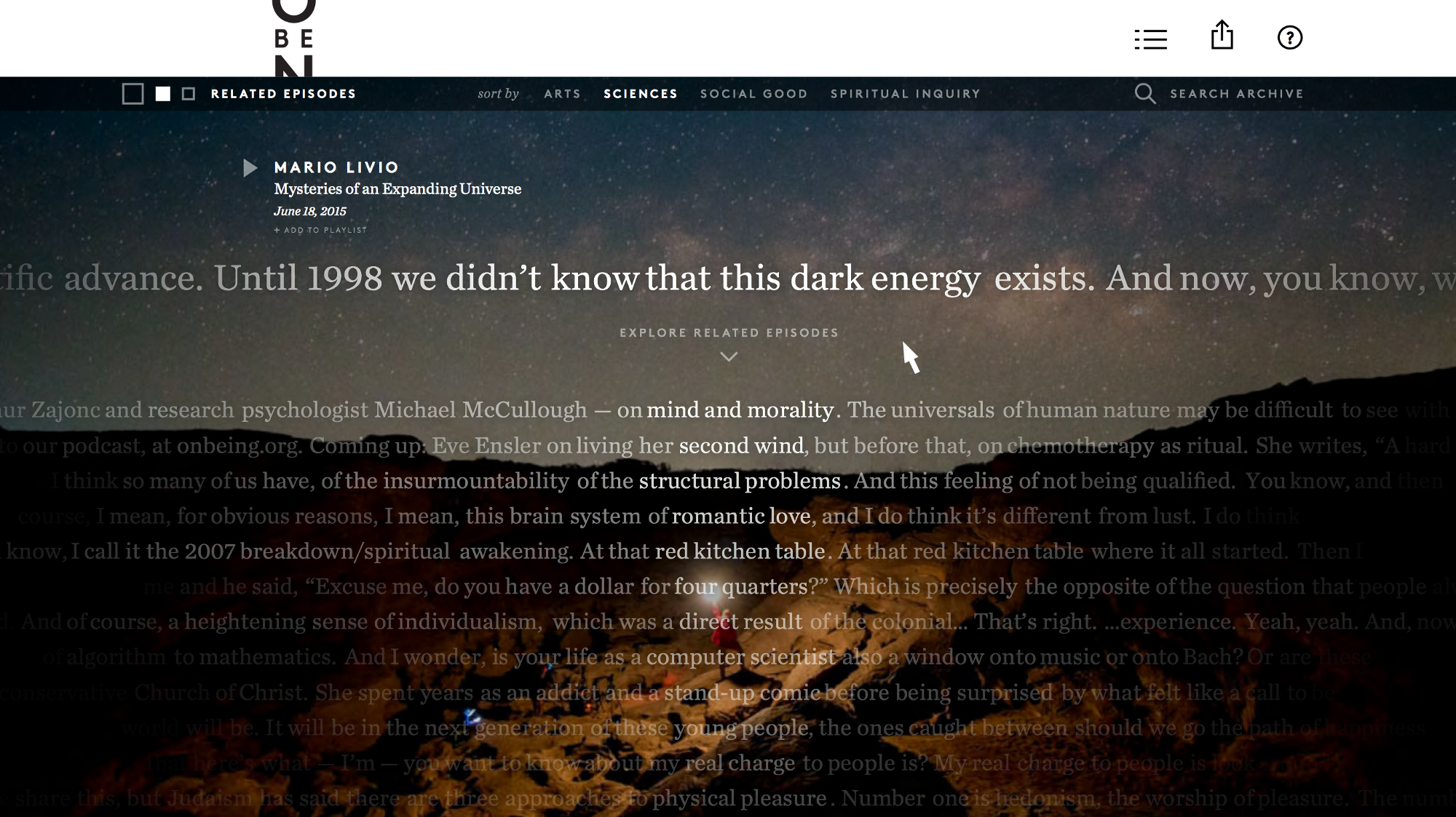
Krista Tippett describes the show as “a conversation across time and generations, across disciplines and denominations.” This sentiment is reflected in the four categories at the top.
We shared a working version of this design direction with people unfamiliar with the project, but the amount of text was creating a problem. Instead of individual lines from separate episodes, many people assumed the text was one large paragraph from the current episode shown at the top, rather than the lovely bits of poetry from that early sketch.
In addition, as we moved further away from an “archive explorer” experience, we now needed to better handle the listening experience for individual episodes. And as the project evolved, the user experience had traveled from 70% exploration, 30% listening, to the reverse of that.
Put another way, Trent and company had asked for “functional and beautiful,” and we needed to get that functional part nailed down further. We continued updating the layout, making the current episode more prominent, reducing the number of episode threads below, re-weighting them visually to feel more like the “whispers” we’d intended, and making the playback (and playlist) experience more obvious and central. The final result can be seen at discover.fathom.info, or in the video below:
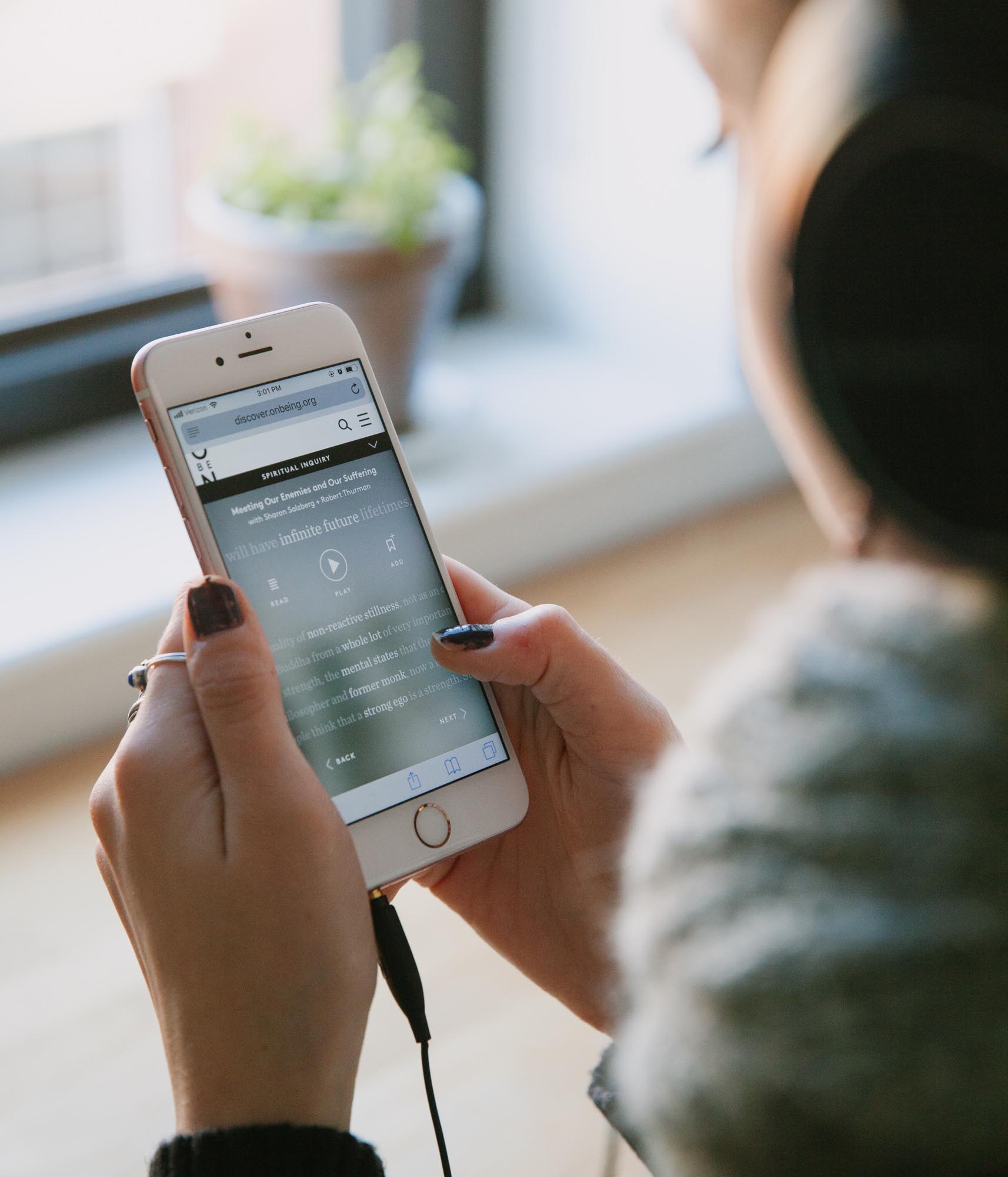
The mobile experience was also important, because so much of listening happens on mobile devices. Having moved away from an archive “exploration” experience, adaptation to mobile was easier, but a lot of testing and refining was required to work out the interaction kinks:
We did keep broader exploration as part of the search feature. This felt like an appropriate place to have a depiction of “everything” in a way that would have been overwhelming on the front page.
Typing into the box at the top of the screen immediately shows a bird’s-eye view of each episode, its short phrase as just a single line on the screen. Moving the mouse reveals the episodes at a larger size, and found episodes (search results) are available in an easily clicked list of entries at the right. The middle area still functions as a vertical timeline, with the line for each search result highlighted to see where the episodes fall along the archive’s timeline.
Updates
Conceived as a 14-week project being handled by 2-4 people throughout, we had our hands full with assembling and vetting the archive, creating a site that could stream all of the episodes, going through several major design revisions, and getting the project shipped on time.
As the project evolved away from its original priorities—from exploration to discovery, from archive to playback—that caused significant shifts to required (and expected) features. Our initial brief was about an “archive explorer,” which from our experience meant irregular (quarterly, yearly, never) updates. We don’t disappear once we finish a project, so the occasional update could be handled manually with minimal effort—certainly less effort than developing an automated system.
But now we were wrapping up an application that launched not from a visualization of the entire archive, but that week’s episode. It was about listening to the latest episodes, with the archive provided as context—rather than where we started, the archive as an introduction to On Being. This new interface carried with it the expectation of weekly updates, which also meant something was needed that could be used by content owners without the intervention of technical staff.
Uh-oh.
And that’s a difficult part of the way that we work: while everyone’s happier with the end result, it just makes it that much more important to maintain clear expectations along the way as the project winds along its path.
In this case, we wound up wrapping a frontend around the server-side tools that we’d developed for the update process, but even that had its own set of hiccups, as there is vast distance between “code used on the command line by a developer who understands quirky error messages and the strange incantations that fix them” and “a hardened web frontend usable by a production assistant.”
Come to think of it, updates in data-centric projects, the lack thereof, and the systems that handle them, is probably a separate post that we need to write sometime.
Takeaways
A few more explicit takeaways that may not be self-evident from just the story:
- Your early sketches should/might/will be bad, and are there to be thrown out. But be ready to listen when a good concept continues to haunt, the way our poster did.
- Use data to inspire form. Not only does it more accurately convey the data itself, but it provides a less common visual. Instead of obvious choices like the dots or a network graph, highlighting the unique phrases provided a starting point for an identity to the piece itself.
- Another way of thinking about the previous point is that a few weeks in, we had something we could have shipped. But it would have been lost in the noise of so many things like it, and would not have held its own over any longer period of time.
- As the project evolves, beware of those shifts that will change other priorities. People are along the journey with you, and may have forgotten the starting point. This burned us a little on the server-side component, even though we were happier with the overall result.
- Related to the project evolution, it’s that much more important to keep checking the current project with people who haven’t seen it to get reactions. In this case, it was essential to fixing how playback was handled. It had shifted from a secondary or even tertiary feature up to a primary feature. Testers later in the process had very different expectations about playback—versus just exploring the archive.
What Comes Next
Aside from more closely studying how people are using the application itself, our interest in the next steps for this project are twofold:
The first step is more pragmatic, and that’s to round out the playback experience, especially for mobile devices. For instance, we’d love to develop the app for offline use so that episodes can be downloaded for times when the network isn’t available.
But second, I can’t stop thinking about this phrase from Krista Tippett: a “cartography of wisdom about our emerging world.” In our heads, that creates beautiful images of what the extent of the archive might look like, and we’d still love to see that map of Ms. Tippett’s world and the people and ideas within it. It’s an image we’ve taken into our other work since completing the project with On Being, and a centering point for how we might come to understand the world of data around us.