
The main headline is that Sentinel, our longstanding collaboration with the Sabeti Lab and IGH, was awarded the MacArthur Foundation 100&Change grant this November — but that sentence alone can’t convey the staggering amount of time and effort that got us to this point.
Establishing a framework for pandemic prevention is about making sure clinicians, hospitals, and policy makers have the right infrastructure in place to communicate vital information to each other (and the public) in rapidly changing environments. It’s also about prioritizing early detection efforts so emerging threats can be contained before they become outbreaks in the first place.
It’s easy to see how important it is to have a seamless flow of information while in the midst of an active pandemic. It’s much harder to keep that global focus during periods of relative stability. Our longtime collaborator Pardis Sabeti saw this firsthand as she fought to combat the spread of Ebola in West Africa during the 2014 outbreak — work for which she was named a TIME Person of the Year.
.jpg)
We’ve been working with Pardis and her partner Christian Happi for years to develop tools for outbreak surveillance and pandemic prevention. After being awarded the Audacious Prize in early 2020, Sentinel was able to begin its efforts in earnest, but implementing such large scale solutions takes significant time and resources. Despite the urgency of the problem, getting the necessary funding for this work has consistently been an uphill battle.
All this to say, we’re incredibly proud of the groundwork the Sentinel team has laid to hit the ground running in the wake of the MacArthur Foundation’s announcement, and we want to congratulate our collaborators Pardis and Christian, who have been fighting for over a decade to keep the need for global outbreak surveillance systems in the public eye.
But we’re not only looking ahead to the future. Our work was put to the test in real-time when Sierra Leone was hit with an outbreak of mpox this April.
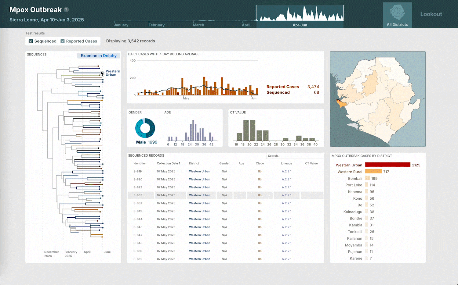
Over the last few years we’ve been developing Lookout, a surveillance tool designed to support public health workers monitor and respond to outbreaks by bringing epidemiological, genomic, and clinical data together into a single interactive platform.
In both an active outbreak and routine surveillance, data is often collected from multiple sources and stored in different formats. Taking in all this information is necessary to understand the full scope of the problem at hand, but it’s very time consuming to manually cross-check information across any number of different platforms.
When mpox began sweeping through Sierra Leone this spring, our collaborators were quickly on the ground sequencing samples and gathering patient data. Within six hours of our team receiving this data, we were able to deploy a custom Lookout view to support Sierra Leone’s outbreak response efforts.
.jpg)
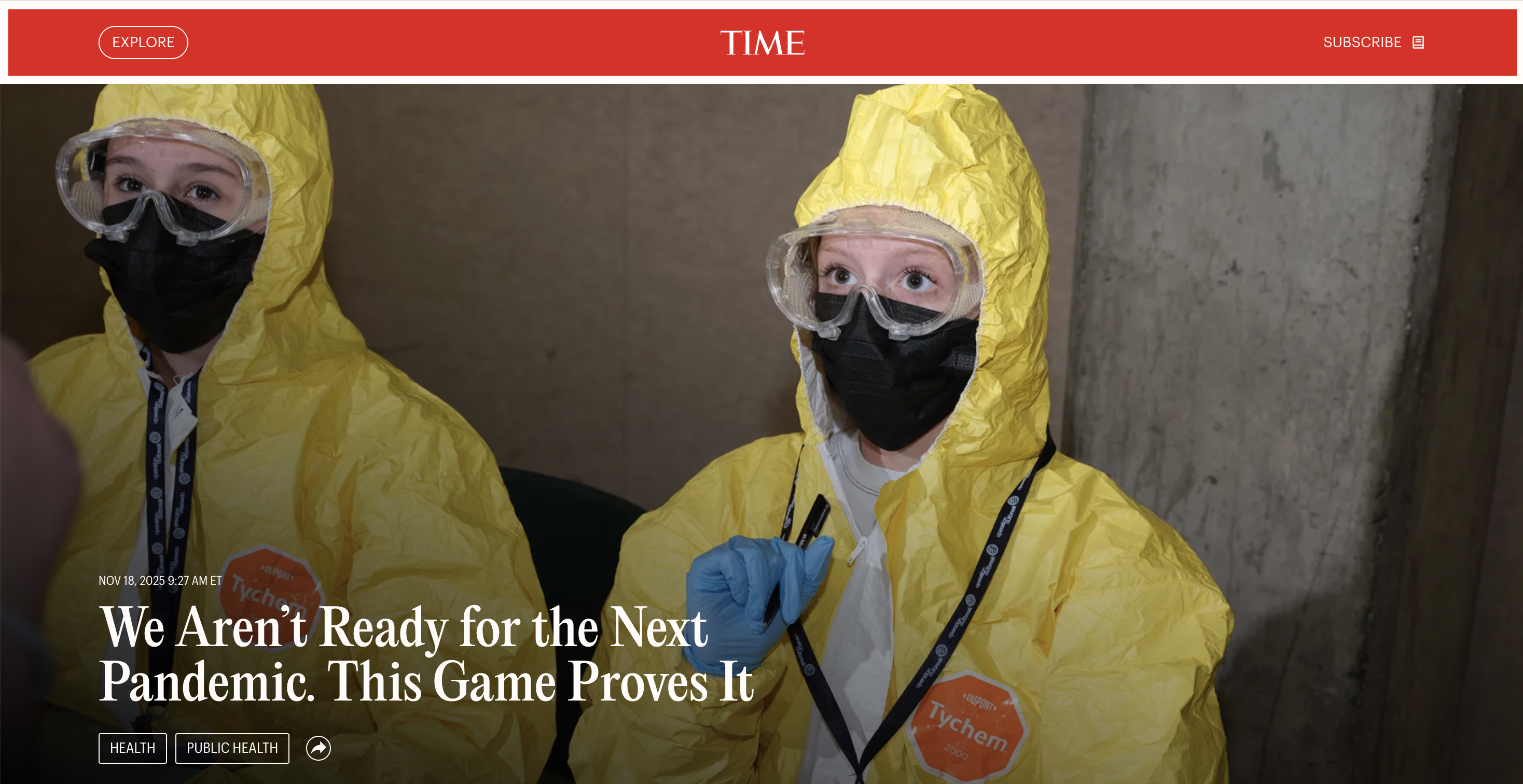
This view allowed response teams to get a quick overview of the What, When, and Where of all information available, with enough detail to spot trends, outliers, and areas of concern that needed closer attention. It was heartening to see the real-world impact of our tools recognized in a TIME article a few months after the initial onset of the outbreak, and we’re all the more inspired to continue building platforms to support this critical work.
Delphy out in the world.
Last summer we launched Delphy, a powerful (and accessible) browser tool for quickly generating and exploring phylogenetic trees. We’re happy to report that Delphy’s preprint is now out for review, but even as we continue to refine Delphy for publication, it is already proving to be a valuable resource for understanding outbreaks as they occur.
Much like with Lookout, Delphy was a key part of our rapid response effort during Sierra Leone’s mpox outbreak this spring. For researchers and responders who needed immediate insight into the samples they were sequencing, Delphy provided a way to get those answers within minutes. This is compared to the hours, or even days, that other tools for phylogenetic inference require to run the same analysis —and all without needing specialized technical knowledge or significant resources to set up a run. You can read more about the inner workings that make this possible in the preprint.
But there’s always more to do! This fall, our collaborator (and Belgian chocolate supplier) Patrick Varilly developed a new Skygrid feature for Delphy that we integrated into the tool’s web interface. Recognizing that many outbreaks ebb and flow over multiple years (if not decades), Skygrid takes into consideration instances in which populations are not exponentially growing over long stretches of time. This allows Delphy to produce more precise results and analyze a broader range of pathogens than ever before.
Preparing the next generation of outbreak responders.
You can teach kids to sneeze into their elbows and suggest that they not lick anything on the MBTA, but there are few good ways to really convey the role every individual plays in keeping communities safe from infectious disease outside of an actual pandemic.
We’ve been working with the Operation Outbreak team for several years to put together an educational mobile game that uses Bluetooth connections between phones to simulate the spread of a virtual pathogen.
.jpg)
In community based simulations, participants act as a group to keep each other healthy during an outbreak of an unknown illness. On the mobile app, they can see their health status, and use that information to decide if they should obtain QR-code based interventions like masks, testing kits, and vaccines to try to slow the spread and protect their peers.
In response effort based simulations, participants function as a broader society — divided into the different groups that need to act (and interact) to stop the outbreak. From researchers to healthcare workers to government officials, everyone plays a role that mirrors the complex (and imperfect) systems we have in the real world.
Post-simulation views show exactly how the pathogen spread from person to person. By getting to see the underlying transmission networks that are nearly impossible to trace in real life, participants are able to better understand the impact superspreaders, patient zeros, and asymptomatic individuals have on those around them.
While Operation Outbreak is designed for all ages, it’s been particularly fun this past year to see more and more high school and college classes decide to use Operation Outbreak to learn about the strengths and weaknesses of the systems we have in place to protect ourselves from infectious disease. TIME observed one such group run a response based simulation earlier this year and published a piece on the experience — complete with snapshots of student “healthcare” workers in full hazmat suits.
You can read more in the full TIME article.
As we head into 2026, we look forward to continuing our work with the Operation Outbreak team to create more ways for the next generation of epidemiologists, healthcare workers, and policy makers to engage with the challenge of pandemic preparedness.
Get in the Rowboat!
.png)
This fall we celebrated Rowboat’s one year anniversary by releasing Rowboat Desktop — a downloadable version of our tool for understanding large and complex datasets.
The online version of Rowboat is designed to help make and share quick insights about your data from any browser on any device, but we know that this is just one approach to working with data. We developed Desktop to address a different set of needs:
- While the browser version of Rowboat can open uncommonly large files, there are limits to what various browsers are able to support. For those who work with absolutely massive datasets, Desktop is equipped to open files several gigabytes in size, containing millions of rows of data.
- A lot of people are uncomfortable dropping a sensitive dataset into a web browser — even though with Rowboat the data never leaves your machine — or they work at institutions where they are explicitly forbidden from doing so. This is a very fair hesitation, and Desktop can provide that extra peace of mind for your data’s security.
- Finally, there are some people who just want to pay once and own their software forever, with no limits on where and when they can use it. Also fair. Desktop is a one-time purchase with with no subscriptions or recurring payments, with the added perk of being available offline.
Both versions of Rowboat have the same goal: to make it as quick and easy as possible to start finding the interesting patterns and questions that arise from your data. Which version you use comes down to the personal preferences and professional requirements that guide how you like to work with your data.
If Desktop seems like a good fit, we would love for you to give it a go and let us know what you think. The one-time purchase price is $99, with a launch discount of $69, but we would like to offer you a discount to purchase it for $49 with the code EITHEROAR at checkout. Why either oar? You can ask Mark if you’ve got about 20 minutes to spare.
.jpg)
To go along with our Desktop release, we also gave our site a fresh new look. We wanted it to be simple for our Rowboat aficionados to get directly into the tool itself, while also giving newcomers a better sense of common data question that Rowboat can help answer.
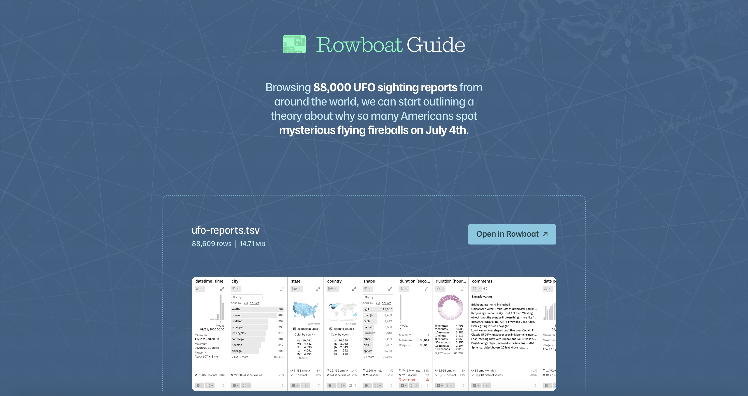
Ellory made use of her need to find joy in every CSV by putting together walkthrough guides of four sample datasets — pulling out the insights and stories that start to form while exploring a file in Rowboat. A particular favorite is this dataset compiling reported UFO sightings across the globe, where we can dig deeper into the uptick of reported extraterrestrial encounters on the Fourth of July.
We’re also always adding new features! Rowboat Plus and Desktop users can turn their city, country, and address level data into latitude and longitude points that can be easily mapped. By selecting “generate geographic coordinates” from a column’s dropdown menu, any valid locations within the column will be converted into latitudes and longitudes that can be linked and viewed on a US or World coordinate map.
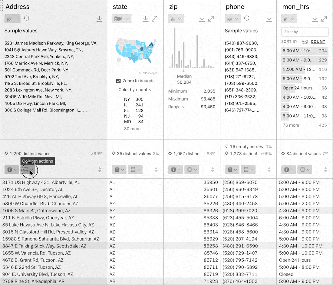
To cut down on the time spent between finding a cool dataset and actually exploring it, we published a Rowboat browser extension — currently available for Chrome and Firefox users. After installing the extension, any URL link to a CSV, TSV, or Excel file can be opened directly in Rowboat by right-clicking on the link and selecting “Open Table in Rowboat.”
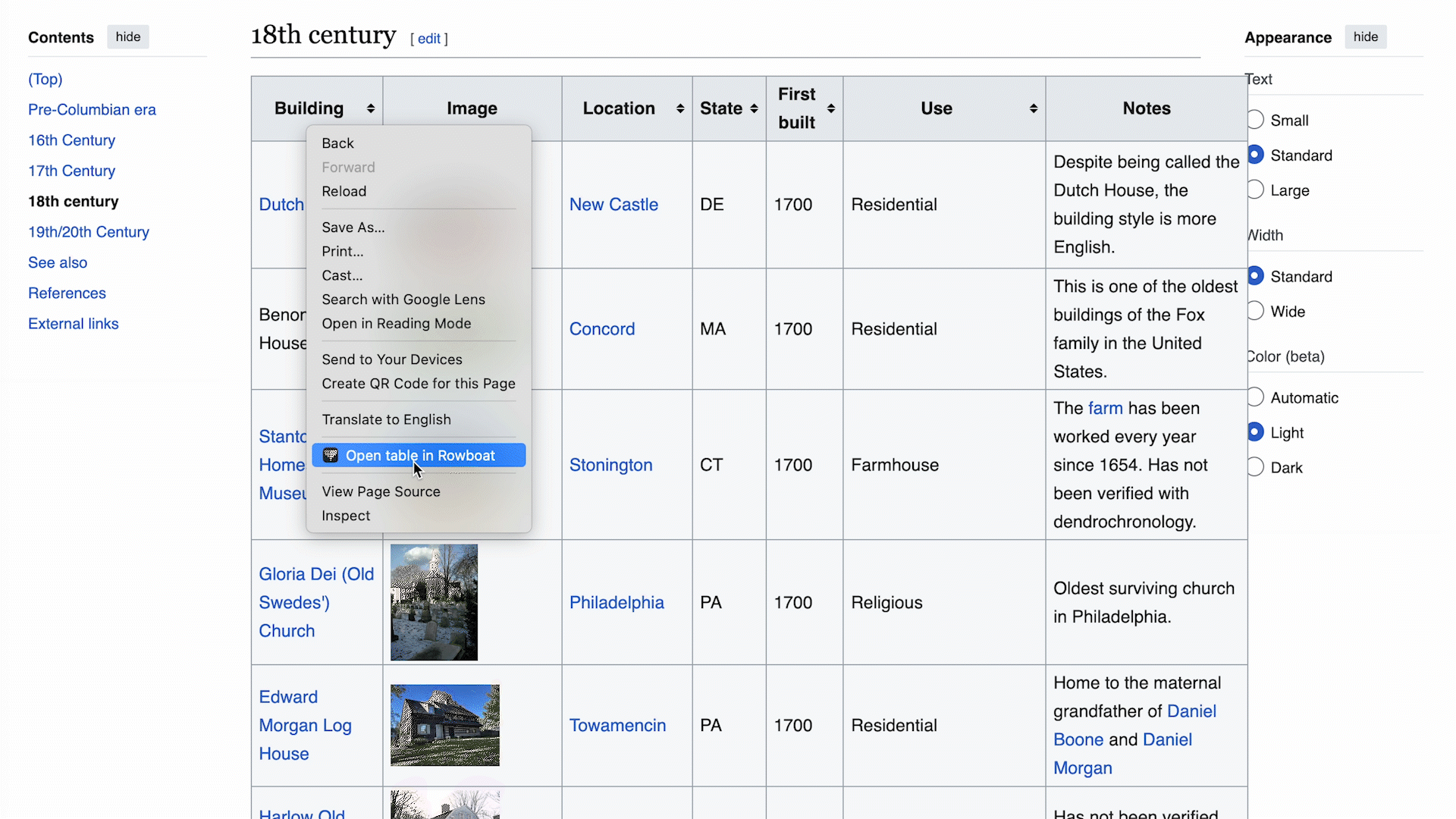
We also made it possible to load any HTML table with the same right-click action. This is particularly fun for the unlimited number of HTML tables you can find within Wikipedia — like this one listing the oldest structures in the United States. If you want to explore beyond the simple column sorts that Wikipedia can handle, viewing this table in Rowboat lets you apply precise filters, map geographic data, and quickly spot trends across multiple columns.
You can install the Chrome browser extension and the Firefox extension now. For our Safari users, yours should be arriving early in the new year!
.png)
We put a lot of our own experiences working with data into our decisions around Rowboat, but it’s incredibly important to us to hear about all the ways in which our community engages with their data. We would love to hear more about the types of datasets you’re most interested in unpacking with Rowboat and any new features that would help you achieve your data dreams. We hope you reach out to us at hello@rowboat.net and let us know what you think!
While much of our year focused on these longstanding projects, we also spent time exploring new domains and revisiting past work.
This summer, we partnered with Recidiviz to make sense of years worth of incarceration records. This work made clear the many ways in which individuals experience the criminal justice system and the need for reform on both a state and national level.
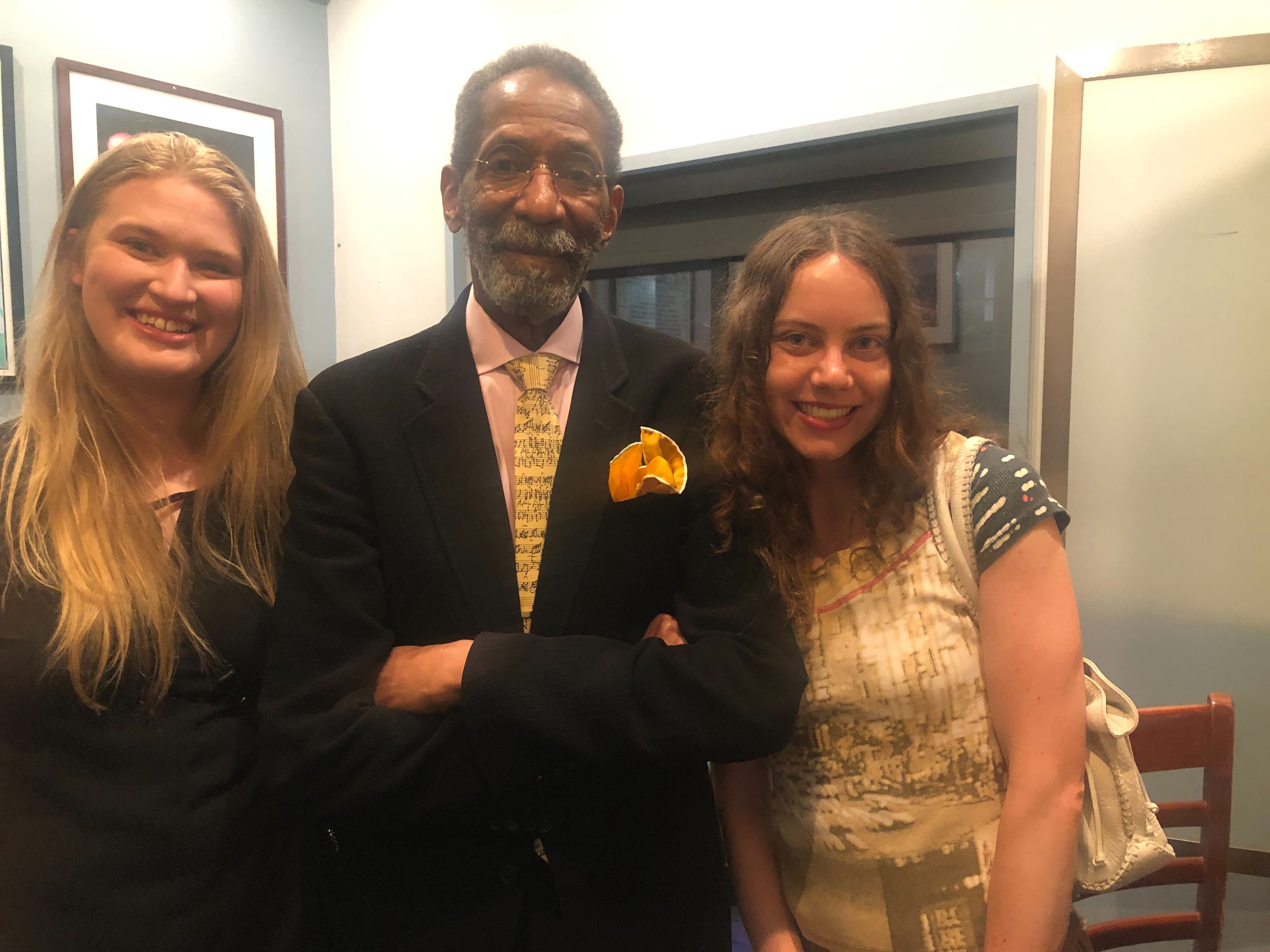
We also made some updates to the Ron Carter Universe and were invited to Ron Carter’s 88th birthday residency at Blue Note. Libby and Ellory were able to attend to see his trio perform — with Donald Vega on piano, Donald Harrison on sax, and of course Maestro on bass. We were so grateful we had the opportunity to join the celebration and even got a chance to speak with Ron Carter himself after the show!
Where weren’t we this year?
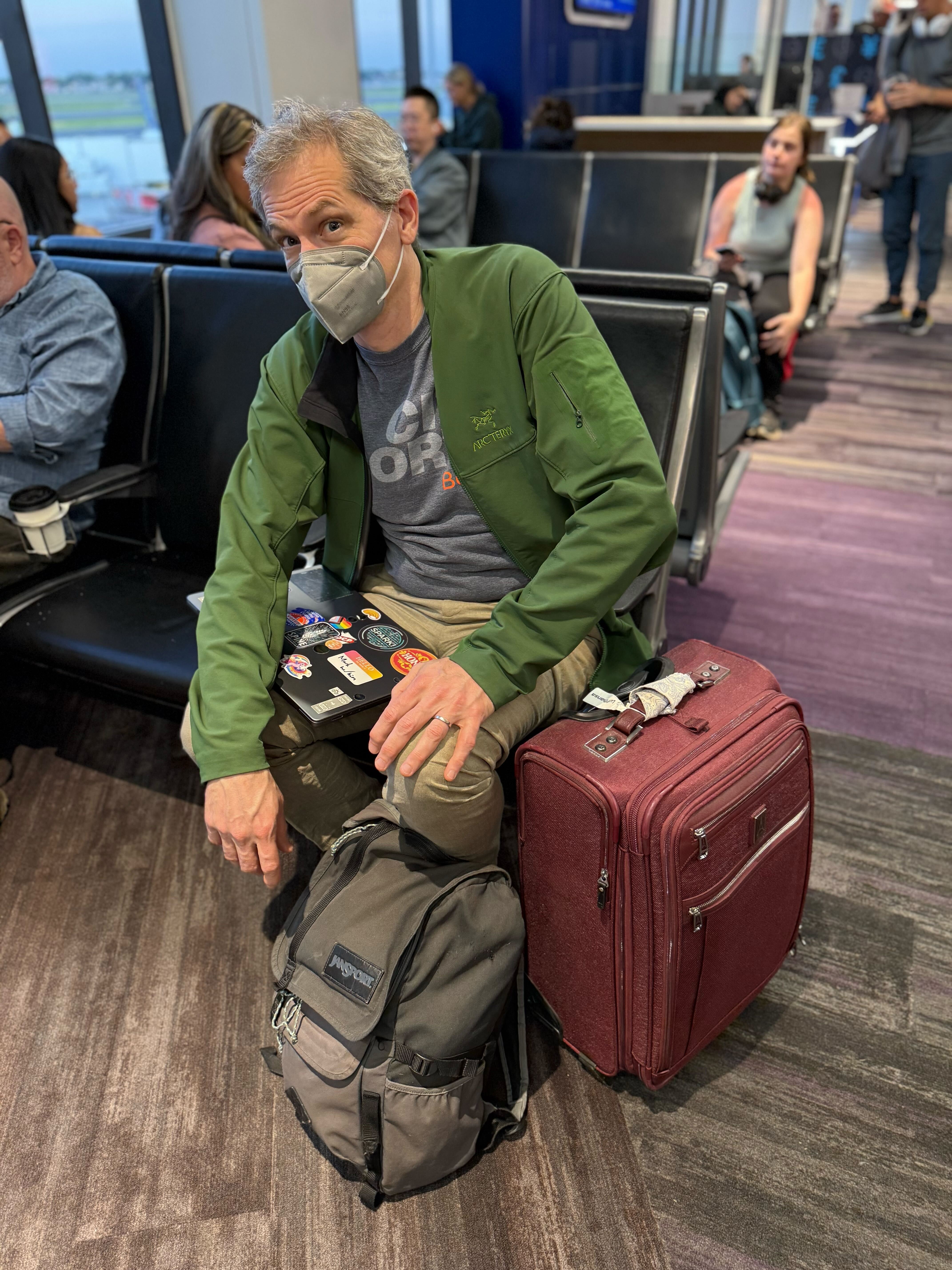
Ben kicked off travel season by heading down to Mexico City to give a talk at the UAM Cuajimalpa campus for the University’s Design, Information and Communication (MADIC) graduate program.
.png)
Soon after, Mark fulfilled a lifelong (or at least two year’s long) dream of taking his Finnish language lessons directly to the source by traveling to Helsinki with Ben. There they hosted a workshop (featuring Rowboat!) at the 2025 Visualizing Knowledge conference at Aalto University, where Ben was also a featured speaker.
We’re happy to report that Mark successfully completed a transaction entirely in Finnish — and we welcomed his triumphant return home with puolukka jam in hand.
Back in Boston, we enjoyed some more local teaching opportunities, with Katherine and Mark giving a guest lecture at Harvard’s CS171 class — conveniently located near our favorite cookie shop. They chatted with students about Fathom’s approach to working with complex datasets while sharing some of our recent (and well loved) projects.
.jpg)
.jpg)
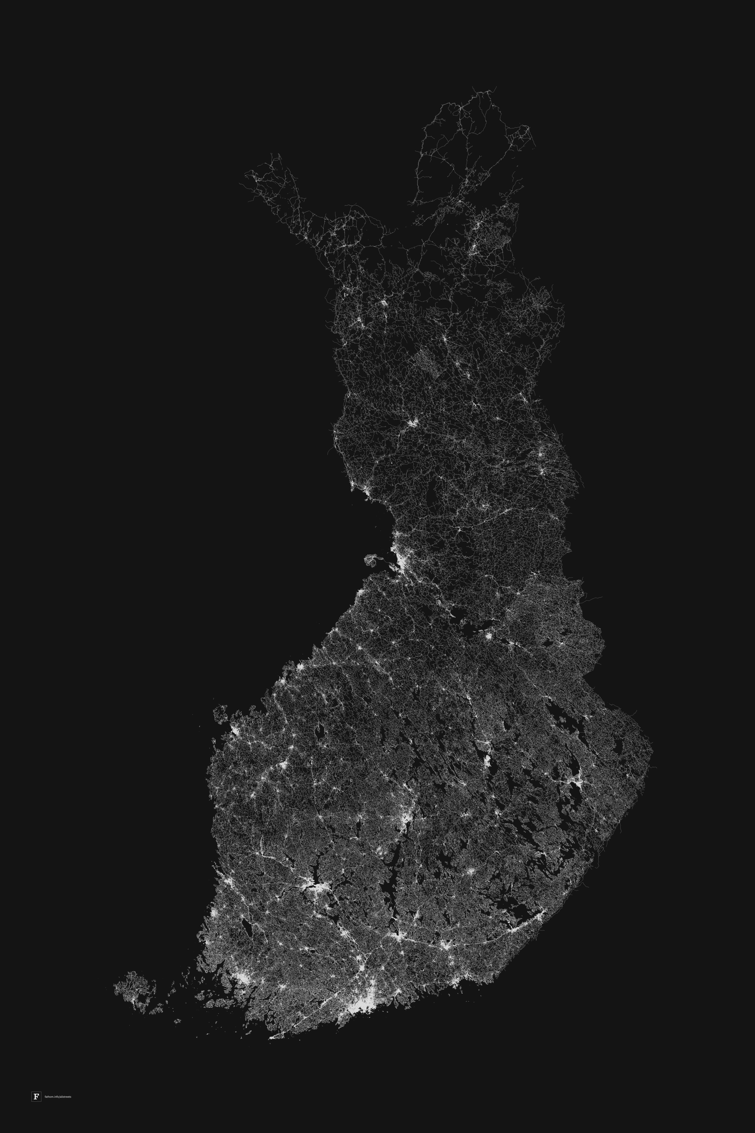
We also hosted the Broad’s Design Affinity group at our office for an afternoon to discuss our approach to building tools for scientific audiences. In particular, how we balance drawing focus to the most relevant aspects of complex datasets without obscuring the little details that provide necessary context. As a bonus, we revisited some of our favorite poster projects, including Preservation of Favoured Traces, Dencity, and All Streets.
.jpg)
This spring, Ben taught his annual Information Design and Visualization class over at MIT — featuring a handful of guest lectures from your friendly local Fathomites. It was particularly exciting to see Rowboat in the hands of Ben’s students, and Ellory delighted in sharing one of her beloved datasets (a collection of ~60k OKCupid dating profiles) with a new captive audience.
We’re always on the lookout for more opportunities to engage with a wide range of students, teachers, and curious individuals — if you’re interested in connecting with our team, drop us a note at hello@fathom.info.
Out of the studio, our works were up around town… and beyond!
Karlie’s incredible e-textile installation was shown at the Emerson Media Art Gallery’s Echoes of the Heart. Featuring poetry swirling around, and dangling from, conductive threads, Karlie’s interactive pieces were built to be nudged and traced by hand.
.jpg)
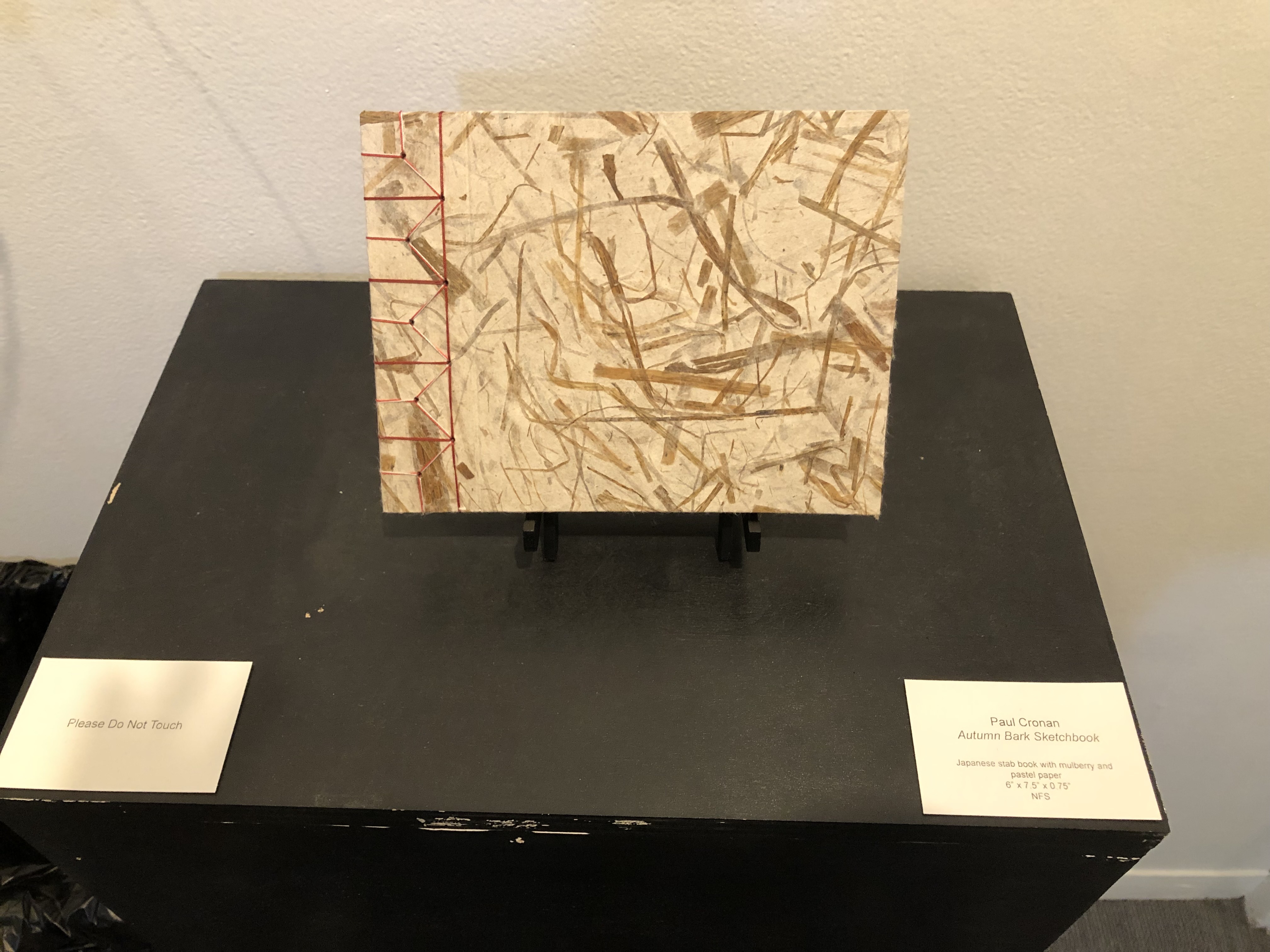
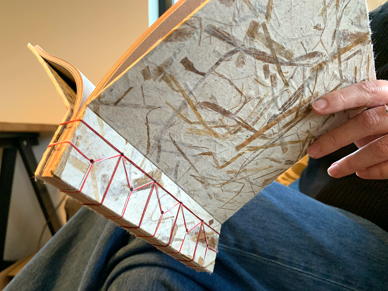
Paul took a bookbinding class and had one of his creations featured in the halls of CCAE. We were, in fact, allowed to touch when he brought his hand-bound books to the studio for us to see up close.
Paul also spent the summer in New York studying type design at Cooper Union.
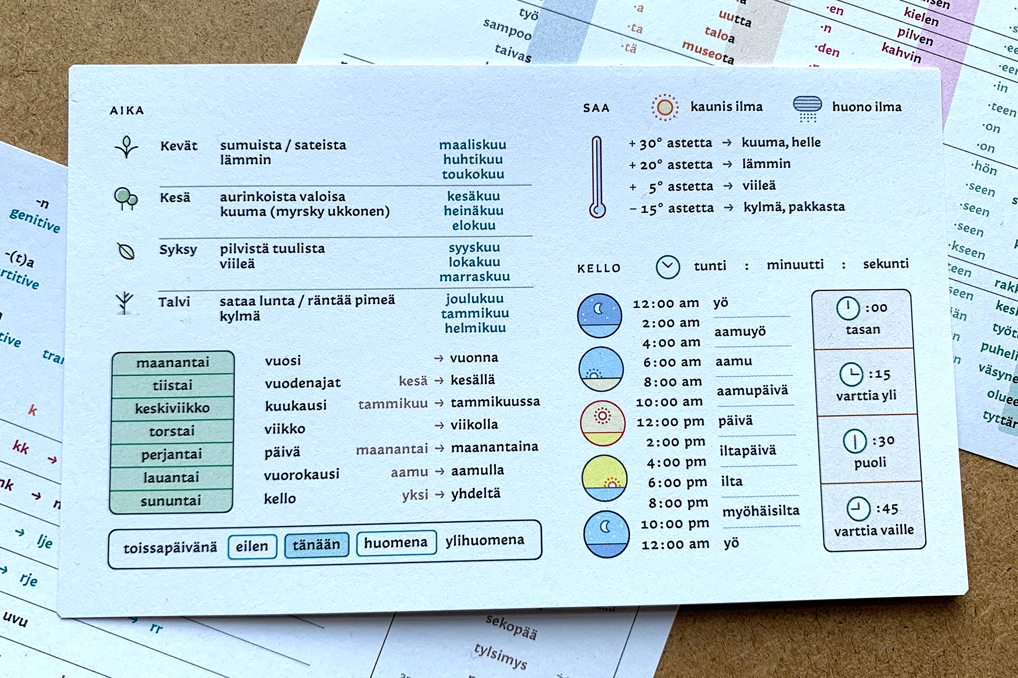
At the end of his intensive 5 week program, he emerged with a font named Lilliput, designed for especially small text. Once back home in Boston, Paul and Mark joined forces to create these delightful Finnish flash cards using Lilliput.
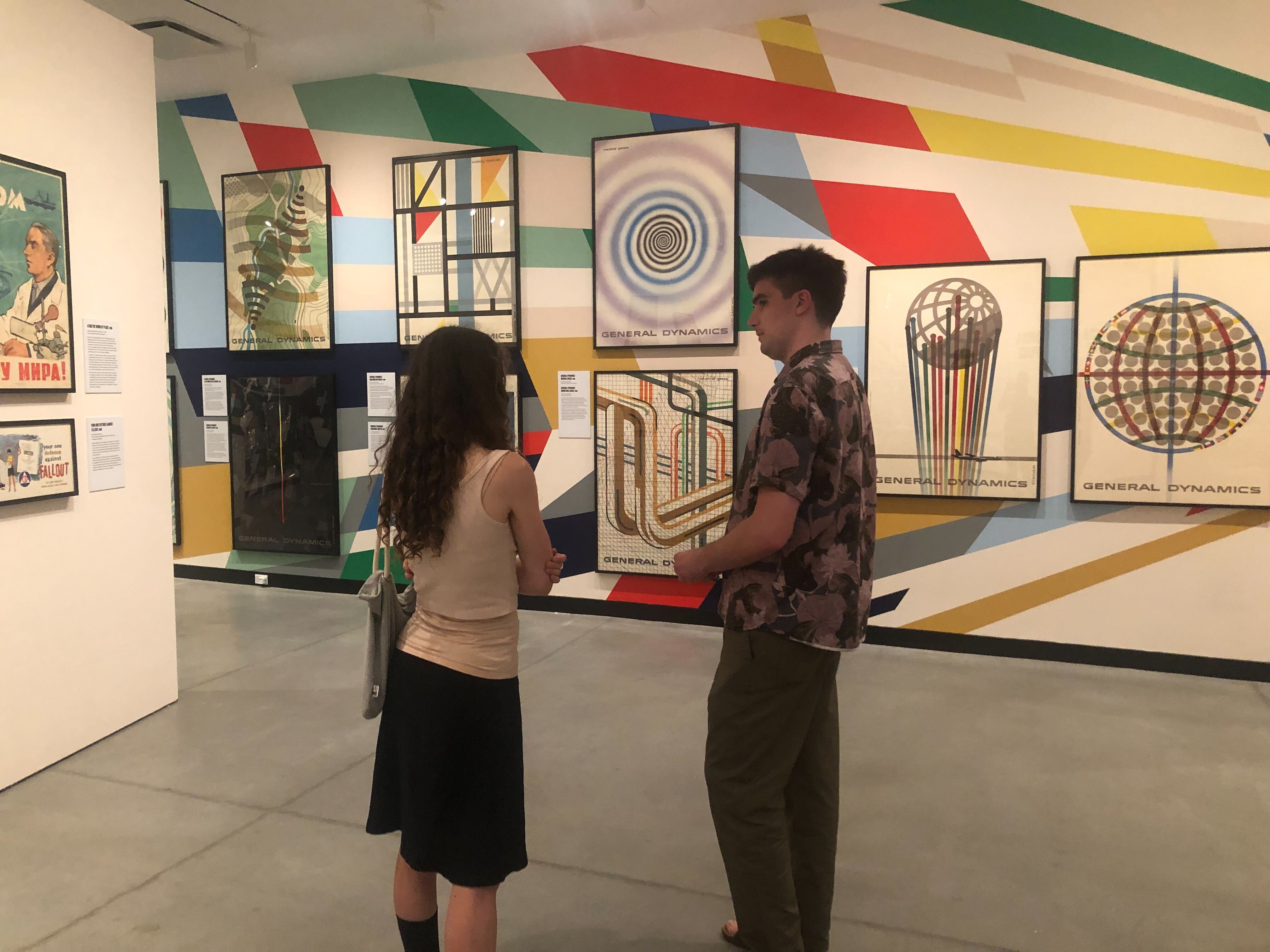
In other NYC news, Ben’s Genomic Cartography: Chromosome 18 went up at MoMA as part of the museum’s Pirouette: Turning Points in Design exhibition.
(1).jpg)
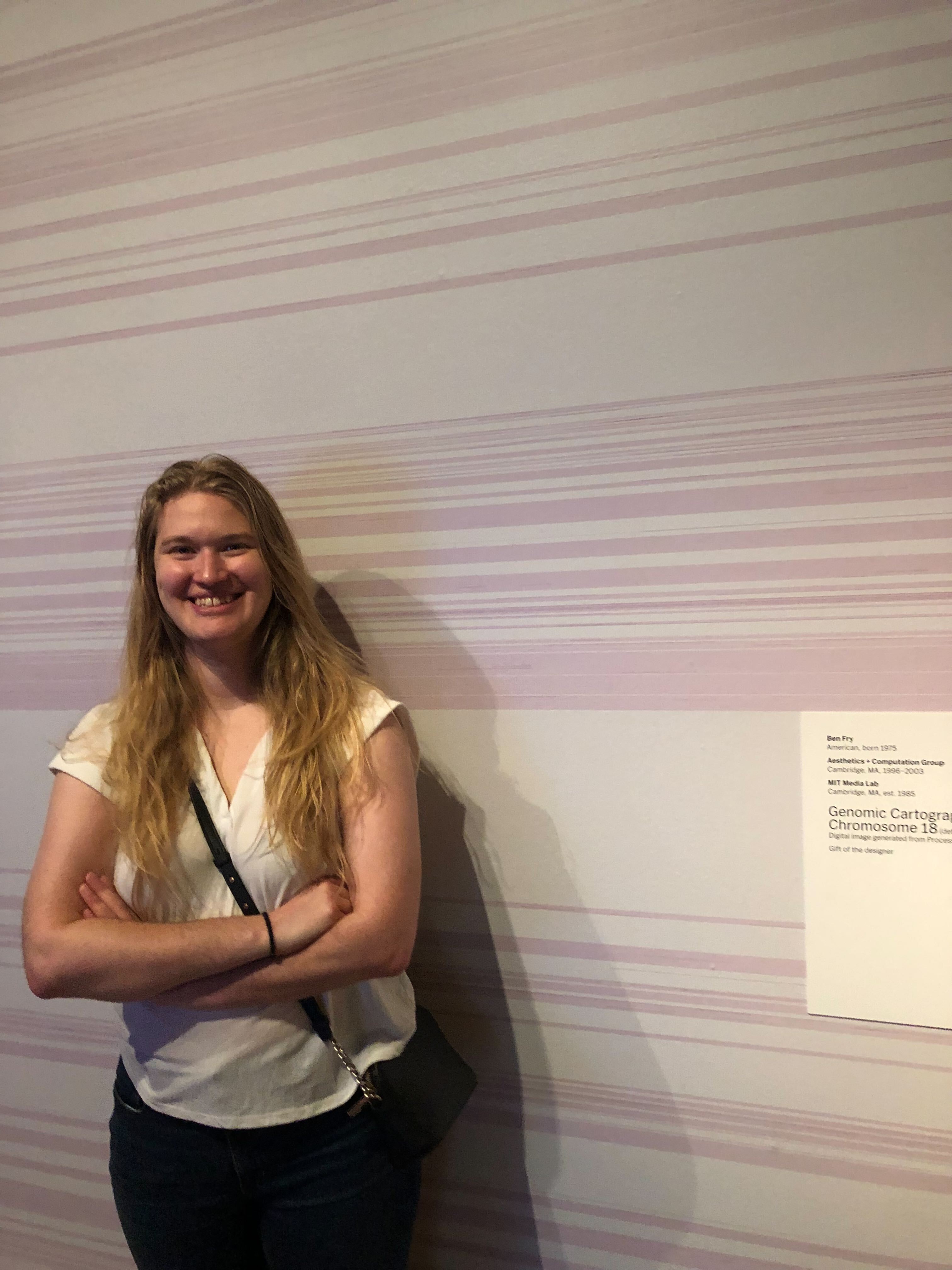
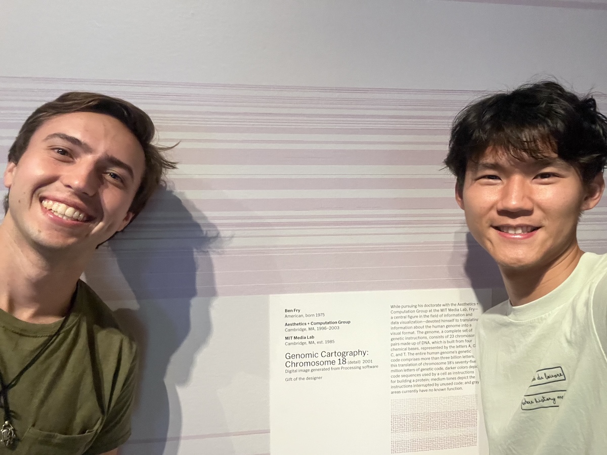
At least one member of the team power-walked 25 blocks in the pouring rain to go see it in person (also maybe the Water Lilies…), but it’s not in her nature to keep bringing that up every chance she gets.
New and returning faces.
After leaving our studio to go off and “finish college” or something, former intern Andy finally returned to us this summer as a full time member of the team. With a streamlined onboarding process of:
You remember everything?
Yup.
It was as if he never left.
Karlie initially joined us as a spring intern and we were delighted when she agreed to stay with us full time. Karlie’s love of music-making and textile arts has brought a fresh wave of inspiration to our cozy crafting corner at the office.
.jpg)
To round off the year, this October we welcomed Molly to the team as our latest junior developer. Molly has embraced our end-of-year chaos by leaping right into the action — all while stoically enduring many long-winded monologues about the best grocery stores in Davis Square.
.jpg)
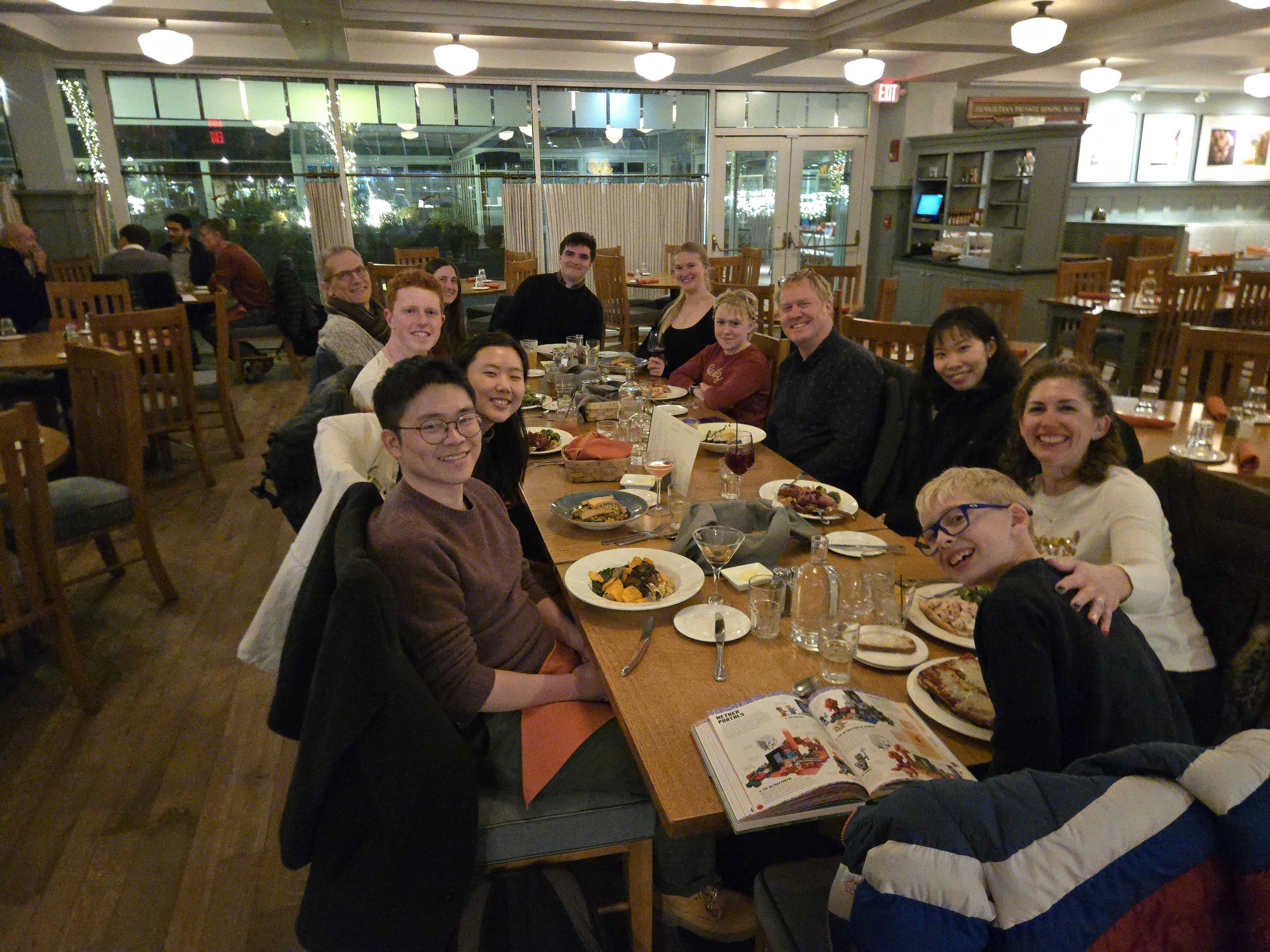
The usual Boston shenanigans.
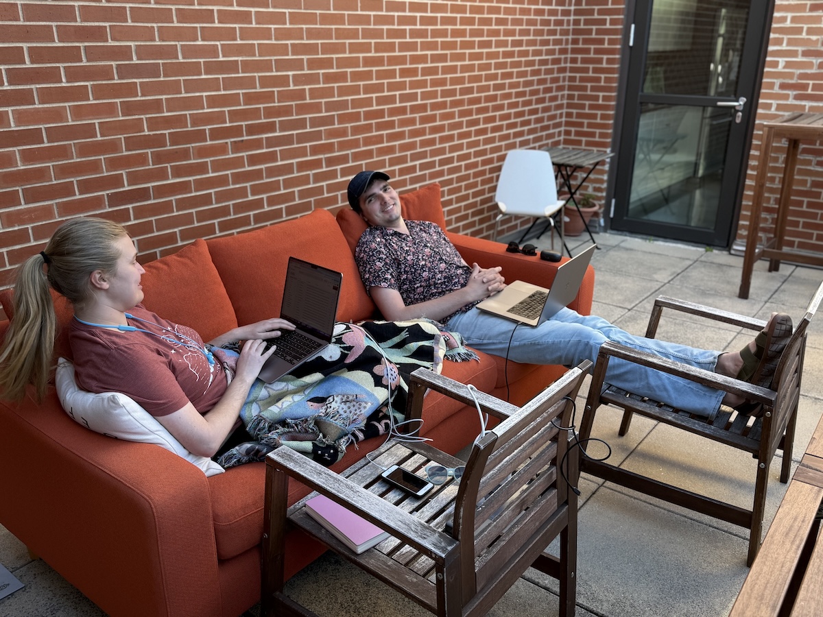
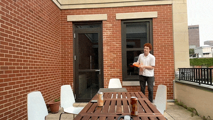
I can once more report that we did not manage to take a full group photo this year, but we did relocate the couch to our outdoor patio for one glorious afternoon of ultimate comfort — so that’s something.
Our weekly Knit-Night evolved into Tinker Tuesday, where we dedicate some time to our side projects and personal explorations. We got a new 3D printer and became freshly enamored with making things. One of our favorite creations was this handheld maze designed with Paul’s incredible Mazeletter.
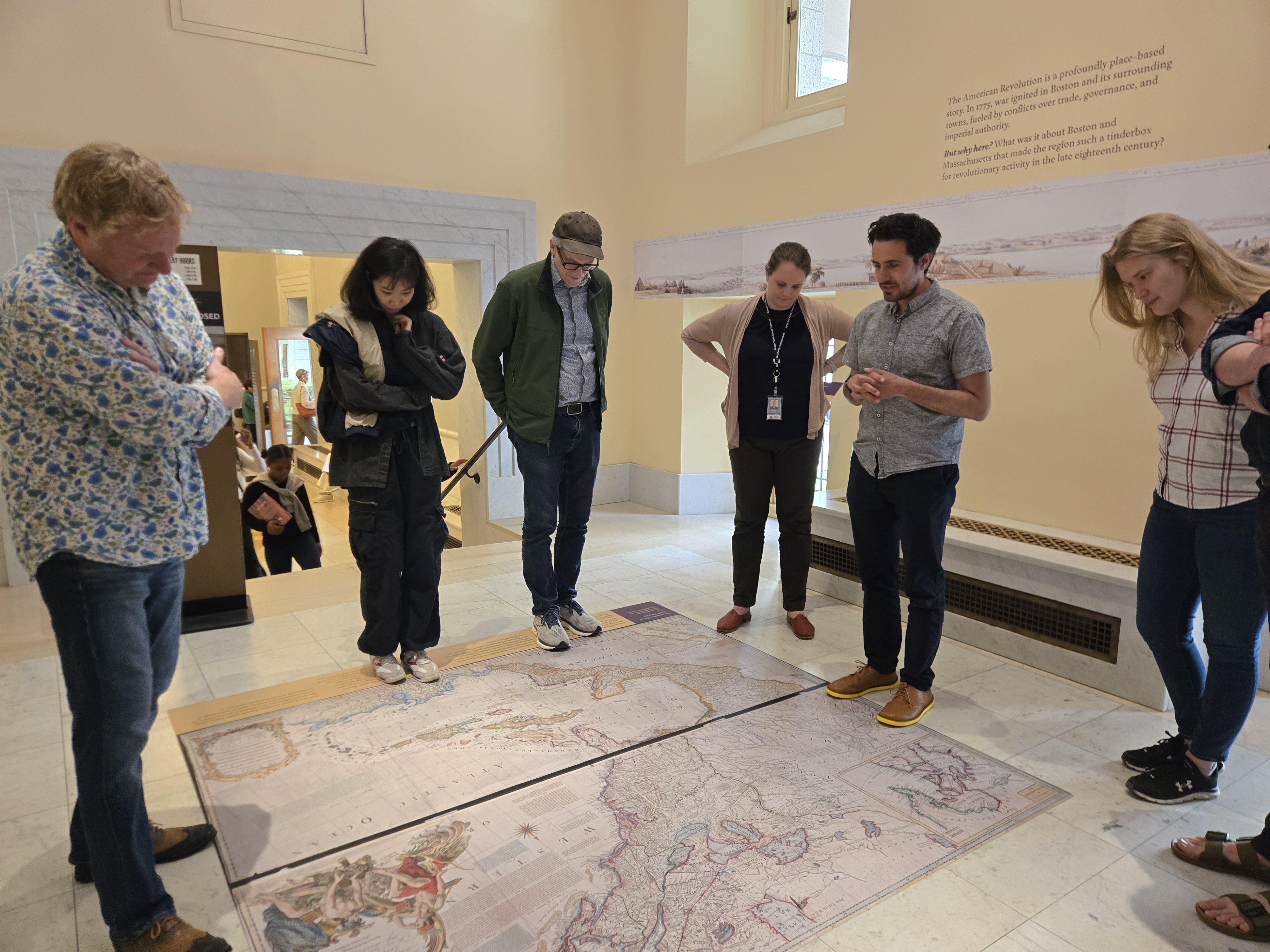
We visited the Leventhal Map Center at the Boston Public Library and had a blast exploring the collection — a big thank you to Garrett and Emily for taking the time to walk us through some of their favorite maps on display!
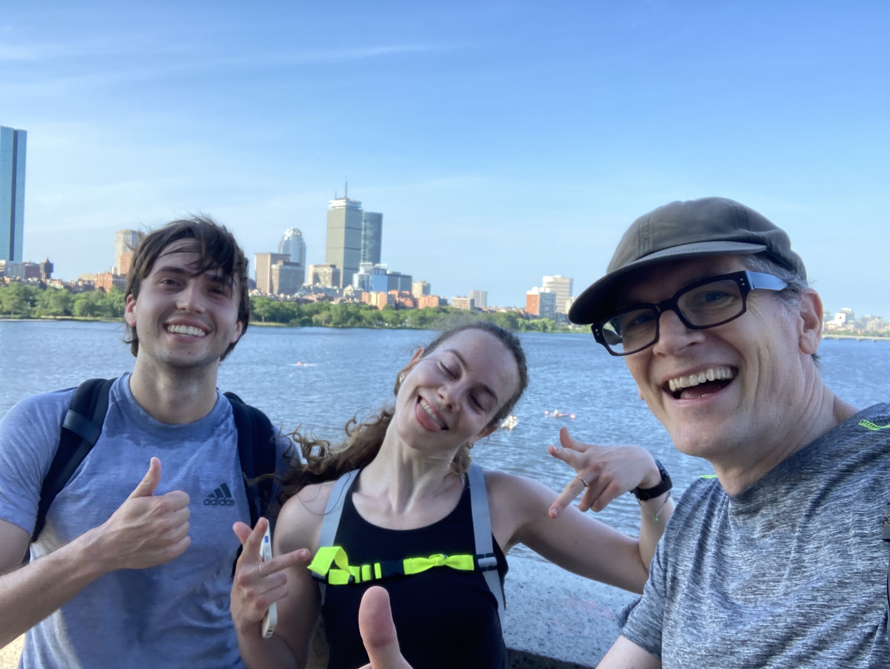
Some people woke up early to run as many as eight miles into the office together (and lived to tell the tale).
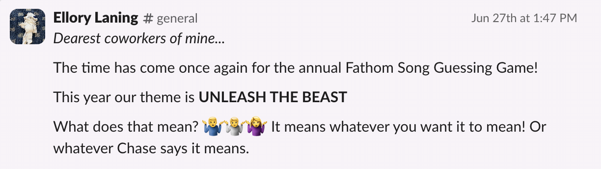
We survived another Fathom Song Guessing Game — a very well named summer tradition. Our theme this year was UNLEASH THE BEAST. You can find all of our submissions collected into a playlist*.
*All but Mark’s that is. He’ll be pleased to know that Spotify can’t handle his beasts.
Every few Fridays we like to have a member of our team (or guest!) teach us about a topic they’re passionate about outside of the office.
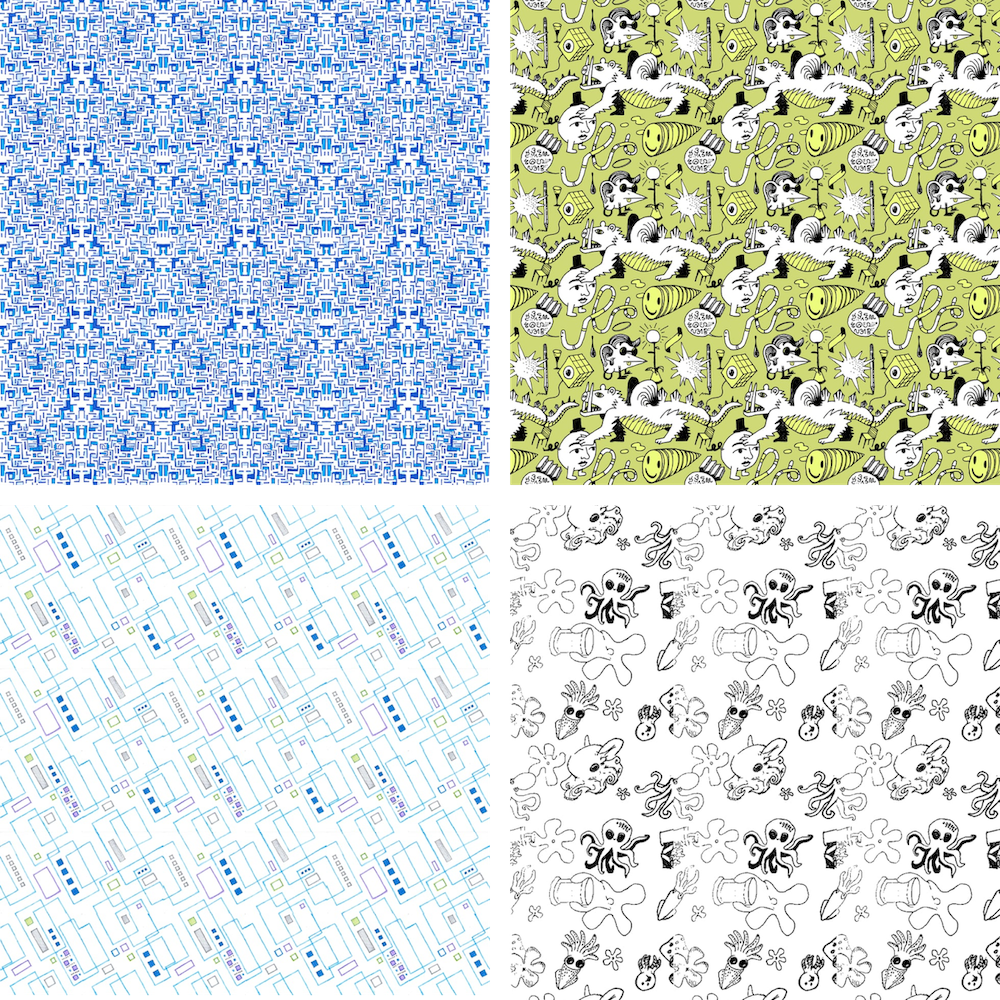
This year, Paul gave us a tutorial on how to create repeating patterns…
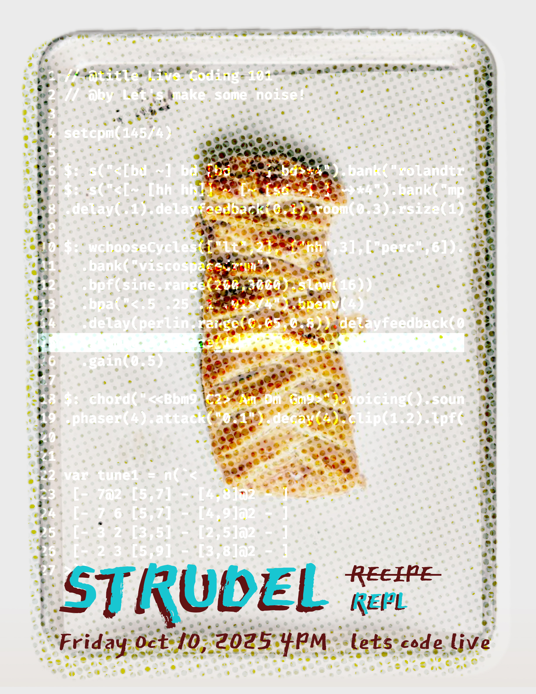
Karlie taught us how to use the music coding environment Strudel to create our own masterpieces — with varying degrees of melodic success and scattered animal noises…
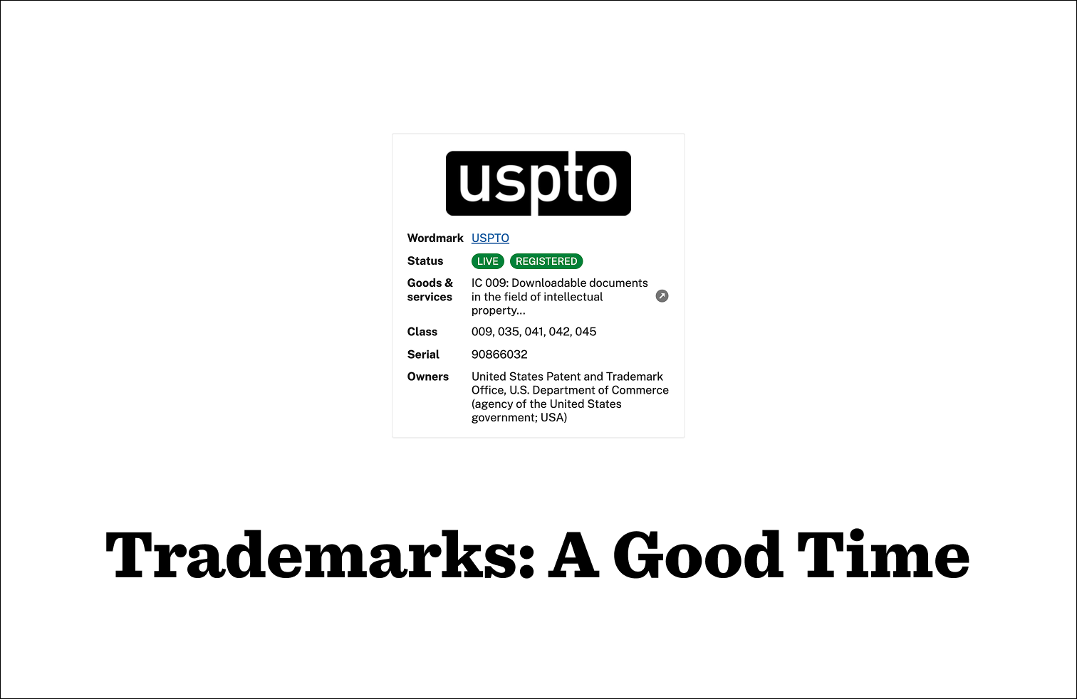
Ellory revealed her soft spot for bureaucracy in the form of an ode to the USPTO trademark database…
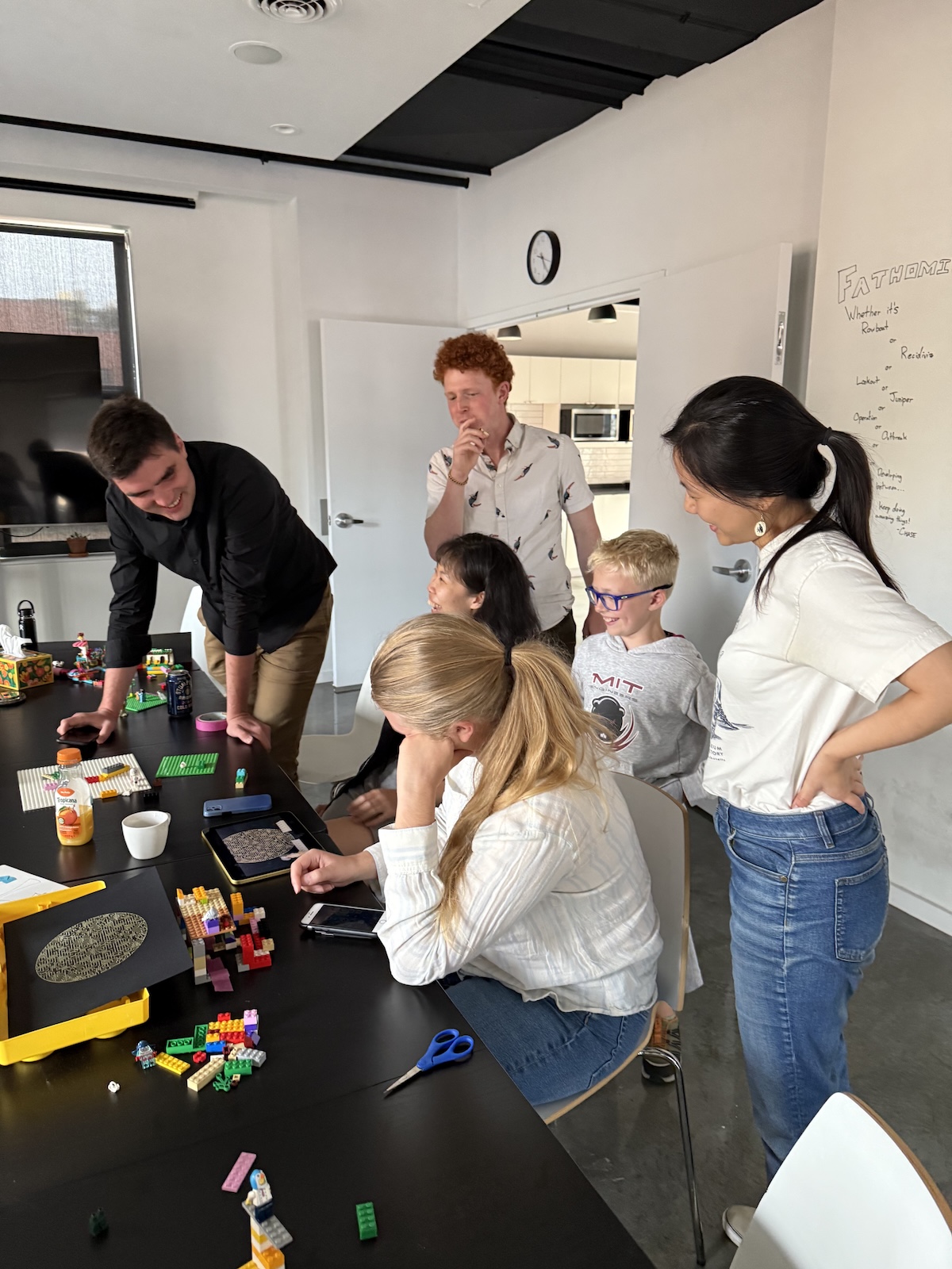
… and Ben’s son Everett came in to teach us how to make Lego stop motion films, while his sister Augusta DJ’d for the group!
The Fathom Test Kitchen.
To give our AxiDraw a well earned break this year, we celebrated the holidays by gathering all our favorite cozy winter recipes together to share with our friends and families. Paul brought our treats and comfort meals to life in a charming animated cookbook! We hope these goodies sustain you in the snowy days to come.
.gif)
How have you grown in the last 15 years??
While I have some doubts that Fathom truly existed before I burst onto the scene in 2023, I’ve been informed that 2025 marked the 15 year anniversary of our studio’s beginnings.
As Fathom’s resident external hard drive, I love getting the chance to share our favorite moments in this post every winter, but I also want to acknowledge that this year in particular has felt deeply shaped by all the years that came before. So many longstanding projects are coming together in really meaningful ways, and that is in large part due to the lessons learned and projects workshopped over a decade and a half of Fathom. Our work builds on itself, and that is a very neat thing to be a part of year after year.
.jpg)
Finally, while I’m still suffering from my annual bout of December earnestness, I just want to say how grateful I am to share my days with such an incredible group of talented, thoughtful people here at the studio. You all make every meeting, every project, and every Friday Patio a pleasure, and I never take that for granted.
With that, we’re going to get some rest and gear up for 2026. Onward!
—Ellory and the Fathom team
We’d love to hear what you’re working on, what you’re curious about, and what messy data problems we can help you solve. Drop us a line at hello@fathom.info, or you can subscribe to our newsletter for updates.