SBIR Grant
SBIR Grant + Research
Capabilities
- Rapid prototyping and application architecture
- UX, engineering, and design research
- Design of user experience, visual interface, and data-driven interaction
As the available amount of data, documents, research, etc. continues to grow exponentially, how can we develop tools and interfaces to work with these unprecedented amounts of information in a meaningful and directed way? Oftentimes, we are presented with “search” as our best or only option – but how can you search for what you don't know? If I want to understand what is unique about a set of documents, I might begin with “where are there common threads?”, or “what is the breadth of topics that it covers?” Ultimately, our goal was to see how the particular nature of a given dataset could lead users to a useful starting point. This was the guiding theme throughout all of our work under the SBIR grant we received in 2015.
We wanted to make sure that whatever we created allowed users to get an overview of their information without forcing them to start with a search query. Within that theme, we explored ideas and metaphors such as the cartography or landscape of a document set, navigating paths, and sifting.
We were approached by a program manager at DARPA who had identified a possible pitfall for new program managers looking to get their research approved. We learned that the quickest way for a project to get rejected (as well as being a major organizational faux pas) was if the proposed project had essentially been done before. However, new managers had to get up and running very quickly, and understanding the full scope of previous DARPA research was near impossible. DARPA librarians could help you search for similar research, but what if you just wanted to understand the landscape of what has been done to date? This was where our first project, DISCO, was focused.
With DISCO, users were able to get an overview of what key terms and topics were most characteristic of a dataset. From there, users could continue to narrow in on topics, explore specific documents and relevant text excerpts, or explore key terms and topics over time. This empowered program managers to explore the entire breadth of what DARPA has done without requiring them to begin with any kind of initial search. However, one of the downsides to this interface was that many of the documents were not captured by the top key terms, and as a result they weren't mapped equally on screen. This was an issue we tried to address in our next tool, Amarna.
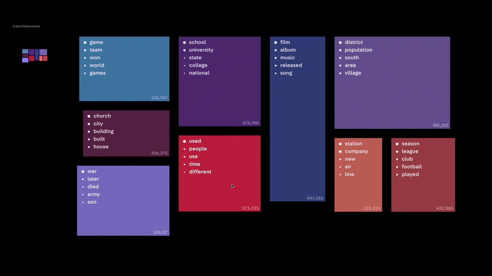
Knowing that we wanted a way to see all documents represented, we built Amarna. The tool used topic modeling and a treemap representation to make sure every document was represented within the breakdown on screen. We focused heavily on the fluidity of navigating between and digging down into topics all the way to the individual document level. This started to give us something that felt much more like a map or cartographic representation of the document sets we were working with. One particular document set was the Vital Articles set from Wikipedia, pictured above. However, we also began to feel like exploring each of the document sets in this tool lost some of the personality and excitement of exploring Wikipedia, so we took a detour to explore how we might bring some of that back.

Using the same Vital Articles set from Wikipedia, we decided to work in what felt to us like a bottom-up or, almost, an opposite direction from Amarna. We began by selecting representative articles from each of the identified topics and illustrating them. The illustrations and short descriptions were arranged in a standard 36x24" poster size to create our own hand-drawn map of Wikipedia. By arranging the articles, we were able to identify more relatable “topics” such as “What is on our screens?” and “What happens when diplomacy fails?” From there, we could ladder up to even larger themes such as “How do we create culture?” and “What societies do we build?”. In the end, we were able to represent the same set of topics, but with a lot more of the same playfulness of going down a ”Wiki Rabbit Hole.” In the same way a viewer might click on an interesting blue link, they might point to an illustration and say “What's that?” and begin the same type of exploration.
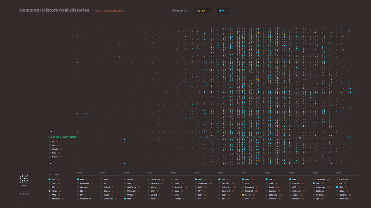
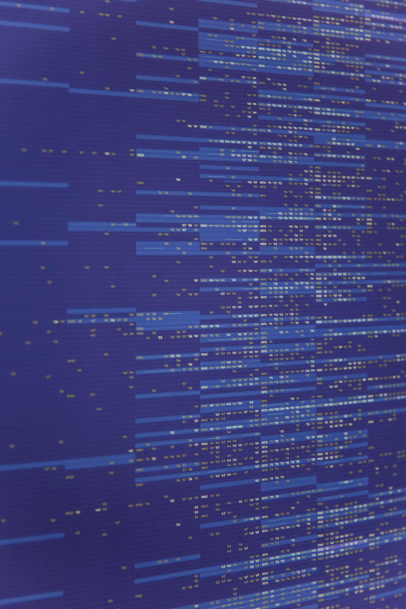
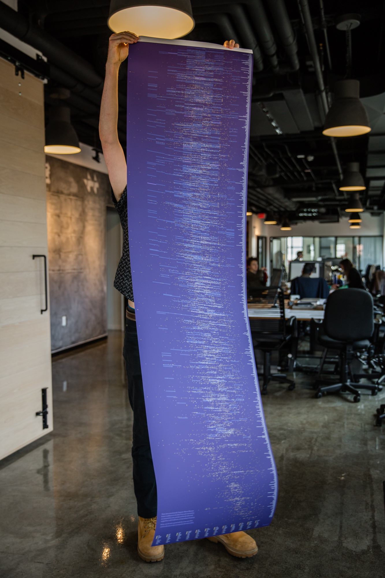
We knew that creating a hand-drawn illustrated version of a multi-million document set was not going to be a scalable tool, but we wanted to take what we learned about embedding the personality of a document set into the tool’s representation into our next exploration. In our search for interesting datasets to work with, we came upon a collection of transcribed interviews with people in the computer science field – it ranged from typical employees at large companies like IBM to field celebrities like Grace Hopper. We had a hypothesis that we would be able to see the general outline of computer science history by visualizing these conversations. Using very simple text analysis to pull out dates (1953, mid-1950’s, the 30’s) and the proper nouns around them, we plotted what things were mentioned on a timeline. We were able to get a very clear, common sense outline of computer history just through this analysis. From there, we worked on refining two representations of the data – an interactive installation and a poster – which allowed us to explore different ways of representing the map of this data. We felt that this was a successful exploration of this dataset in that the two pieces really captured the landscape of the data, and provided us with a lot of ideas to bring into further tools.
During the timeframe of this grant, a few significant document dumps were released. From the Panama Papers to Osama Bin Laden's computer files, these were massive and unstructured collections of largely text, image, and video data. Around the same time, we had been having a lot of discussion around the question, “What is the computer good at versus a human?”, and vice versa. With this in mind, we created a tool called “Folio.” Behind the scenes, this tool would run topic modeling for text, or image recognition for images/videos to sort the data into an initial set of topics. From there, a user could quickly browse through documents, videos, and images and sort them into “piles” for further viewing later. Similarly to attacking the daunting task of organizing a messy desk, we wanted a way for users to continuously refine the dataset they actually wanted to work with until they had a set to bring into other analysis tools we were developing. Even in more straightforward situations, such as reading for research, a single PDF doesn't exist in a vacuum. The ability to look at a collection of texts as a whole, quickly swap between them, and sort them into “piles” for later can be invaluable.
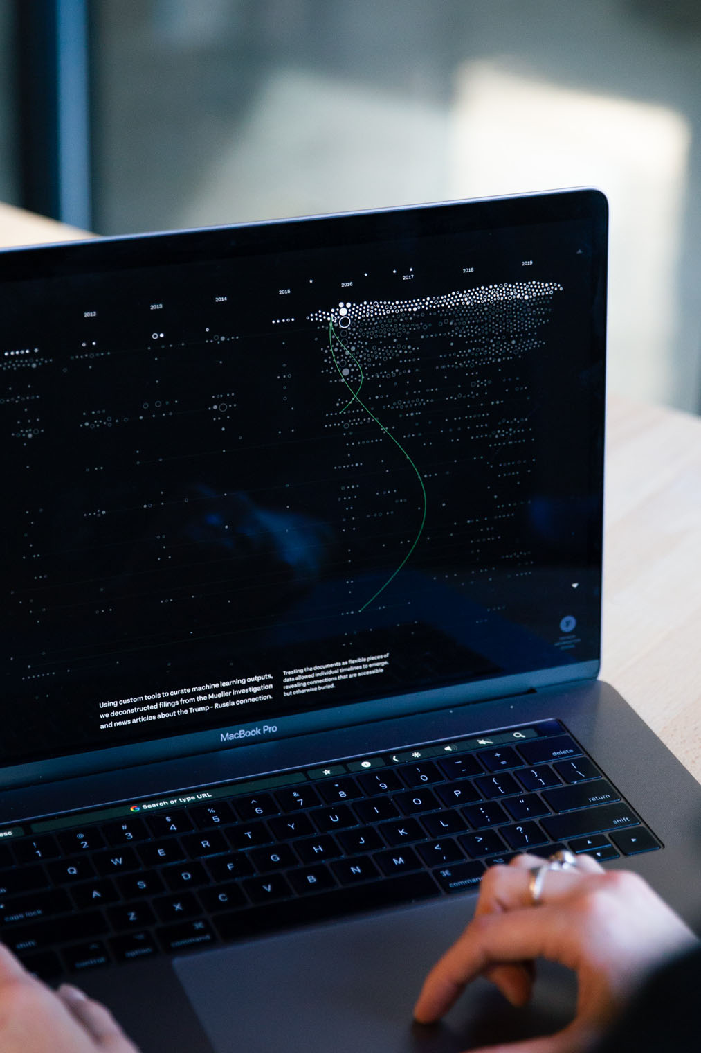
Continuing on the theme of letting the computer and humans each play to their strengths, we worked on a few tools for the Trump and Russia collusion investigation. While waiting for the Mueller report to be released, we put together a project called “Porfiry,” which pulled together news articles about Donald Trump and his associates to create an overall timeline of key players and their possible associations. Possible associations are key here – in a world where more things are relying on the black boxes of AI, we wanted to stay away from having the computer come to any conclusions. Humans are particularly adept at context clues and inferences, so we wanted a way to enable the computer to present possible connections, but keep the actual conclusion-drawing to the human side of the equation.
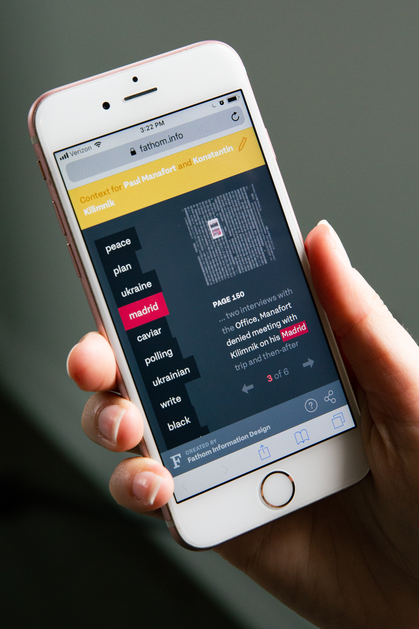
To push on this concept further, we put together a piece called “ConText” for the Mueller report. Knowing that news organizations would be doing their due diligence in reading the document and putting together their walkthroughs and editorials, we wanted to create something that could function as a companion to those efforts. ConText was a way for someone to get a quick overview without editorialization. We adopted some of what we built for Porfiry for this piece, but simplified it for a mobile-first representation, to cater for how most people consume breaking news. The piece allowed a user to select one or two individuals, see where they showed up in the document, and, like the Computer History pieces, what key words showed up around them. This allowed for a very fluid way to skim read the entire report as a companion to the editorial pieces that were out there.
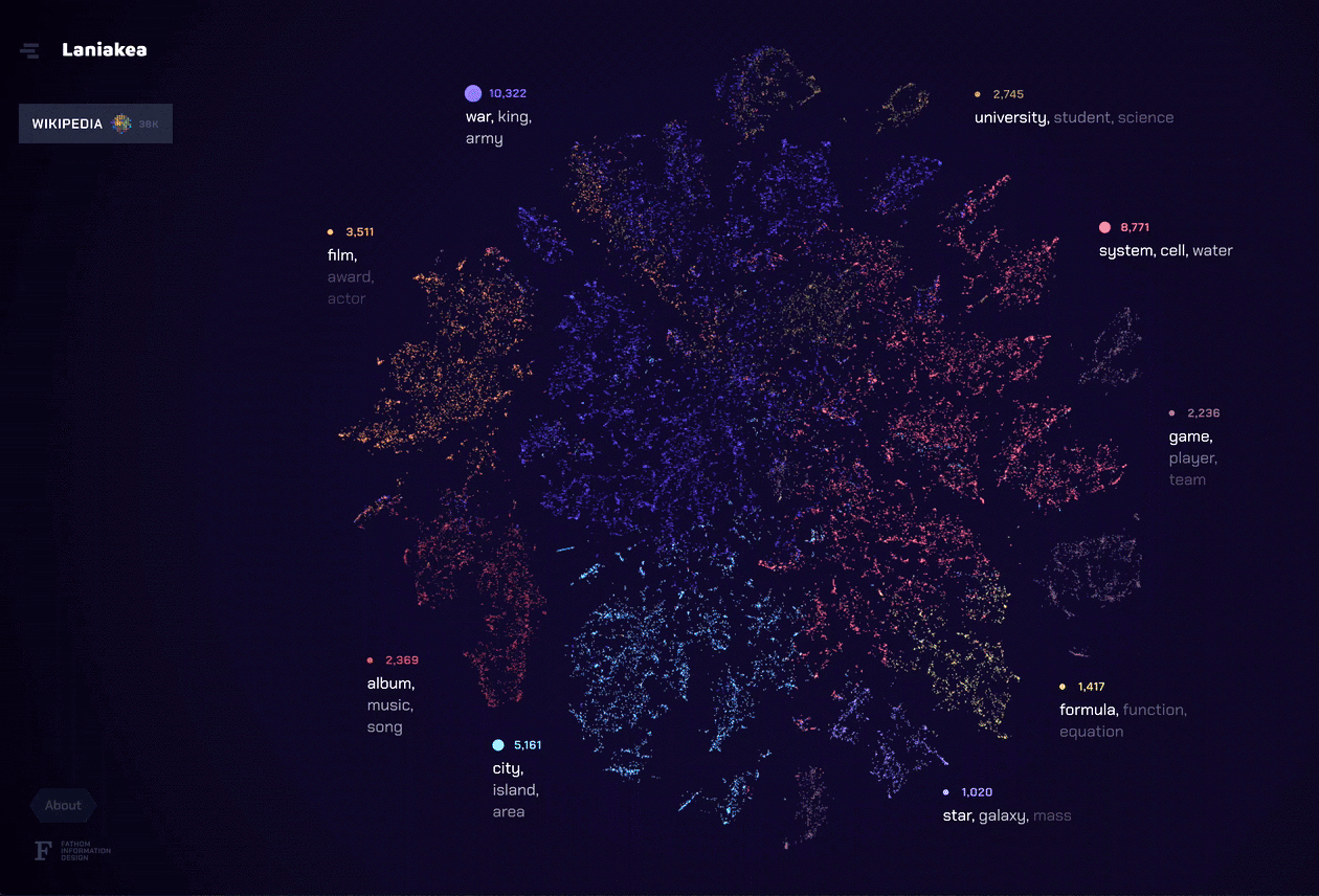
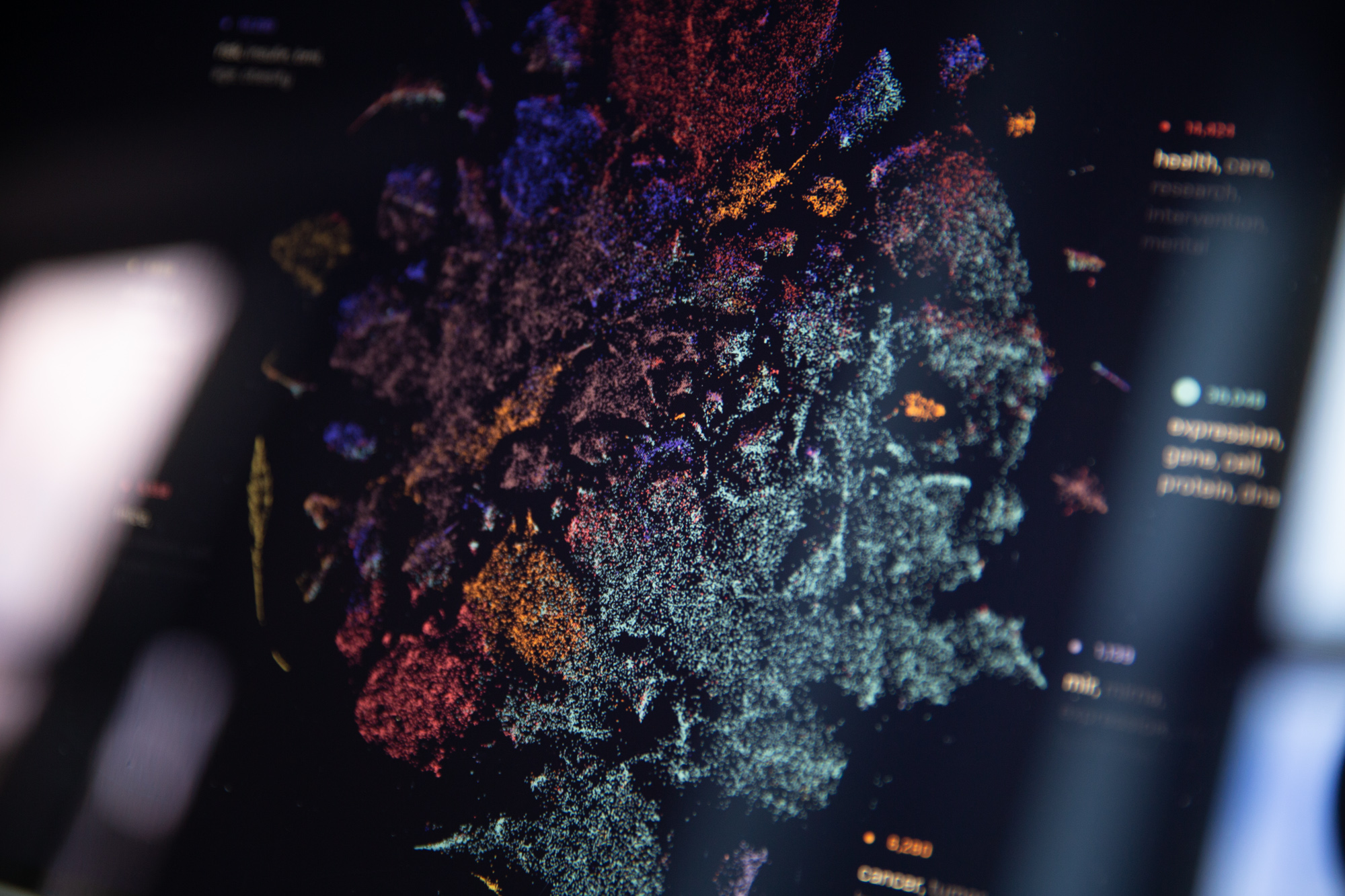
As we neared the end of our grant period, we knew we wanted to create something that brought together all of the elements we learned from the previous explorations. For our final tool for this project, Laniakea, we found a way to marry a complete portrait of the document set like Amarna with the individual document representation of DISCO. The t-SNE layout allowed the user to see possible relationships between documents through a landscape of topics, but left actual conclusions up to the viewer like in ConText and Porfiry. We also focused on bringing fluidity to the navigation of the dataset, which ties these different methods of analysis (topic modeling, t-SNE, etc.) into a unique and powerful tool.